
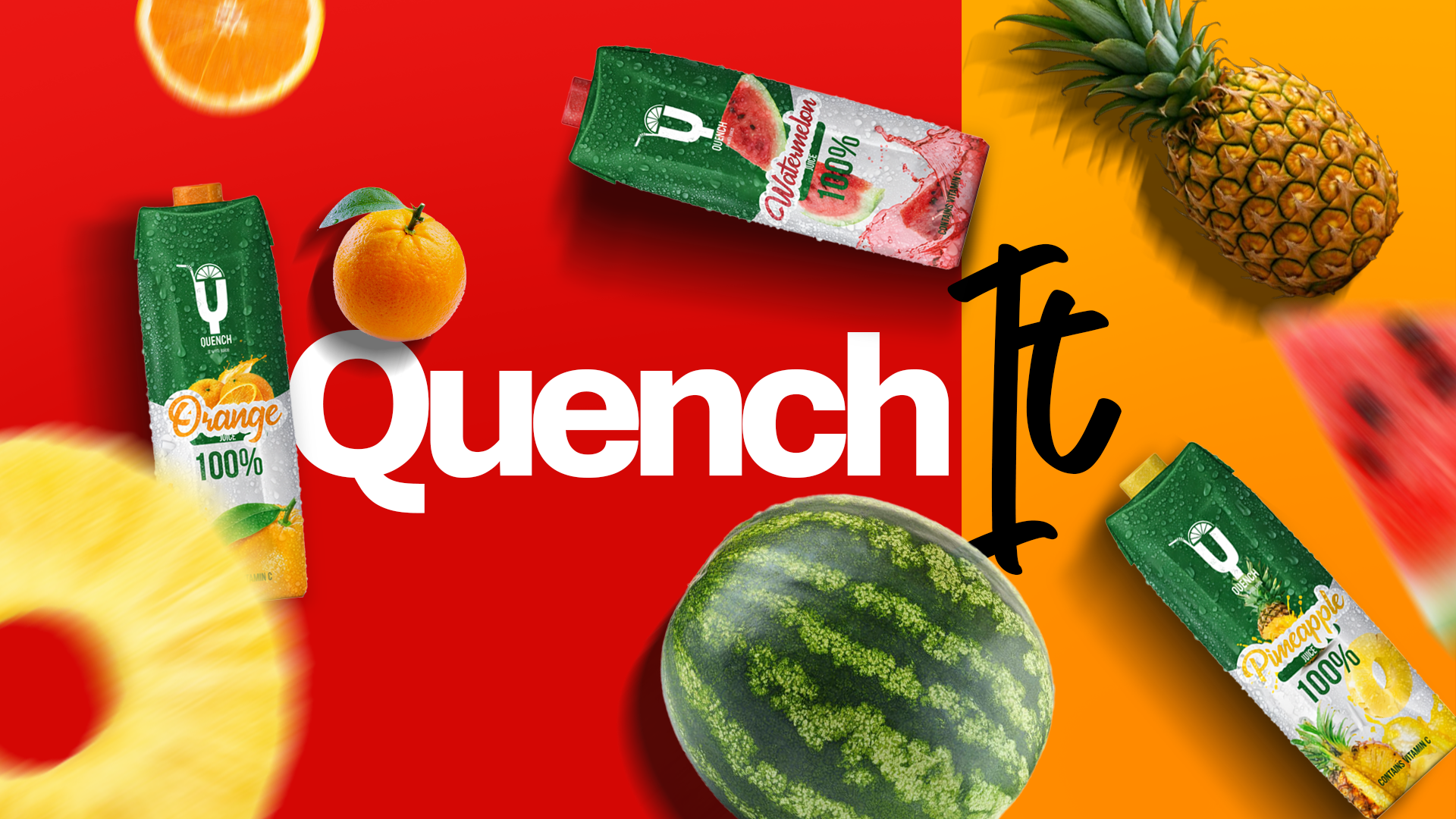
001 / Brand Identity / Packaging Design
Quench Branding
A bright juice identity built to make real fruit feel immediate. Quench brings one bold idea across three distinct flavors.
- Brand
- Quench
- Year
- 2019
- Role
- Brand & Marketing Design Lead
- Tools
- Illustrator / Photoshop
- Focus
- Brand Identity / Packaging / Marketing
- Deliverables
- Logo, packaging, flavor variations, brand applications, color direction, product mockups, posters, social graphics, and promotional assets.
Overview
Freshness at first glance
The story begins with real fruit, bold color, and an everyday carton. Every element is designed to make Quench feel lively, direct, and ready to drink.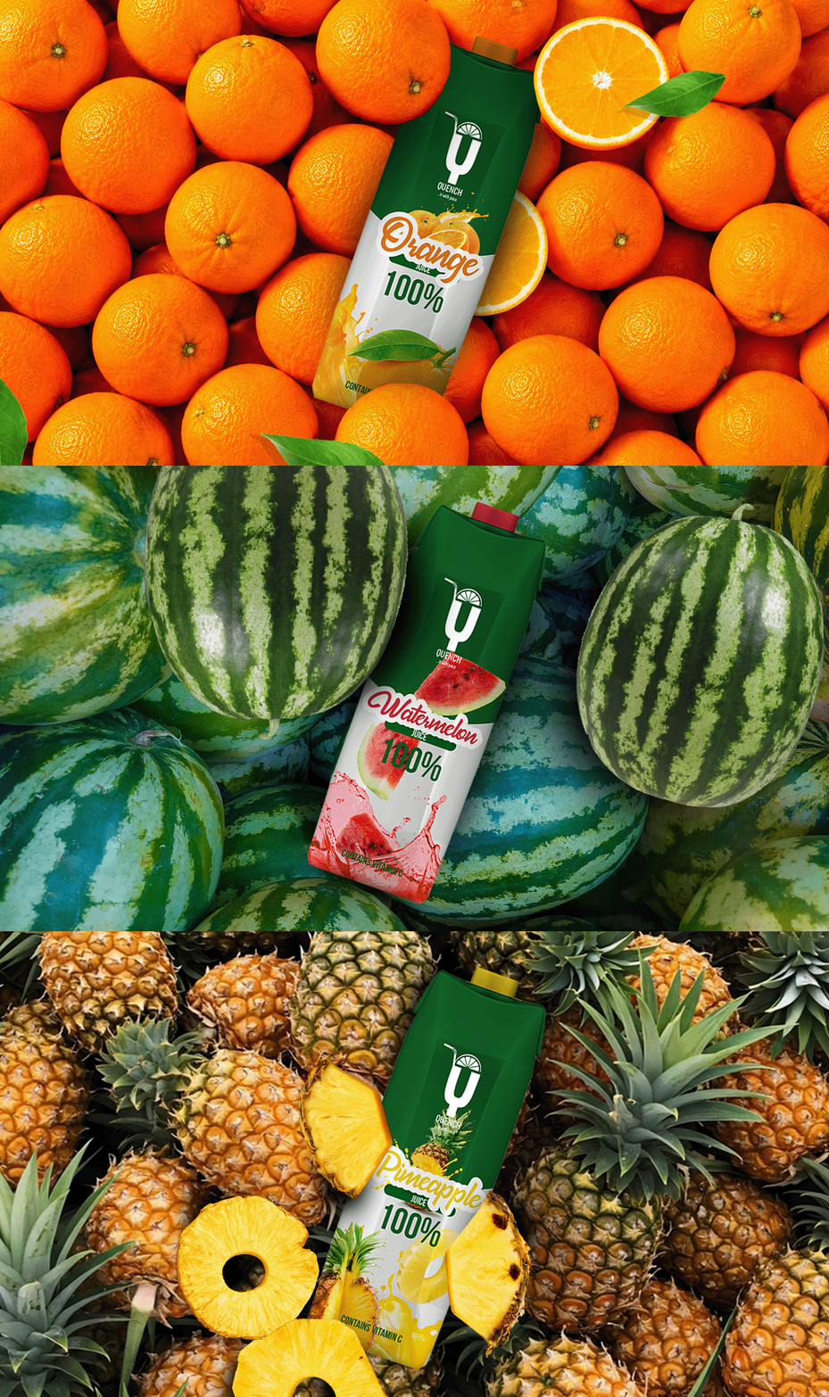
Challenge
One family, three personalities
Orange, pineapple, and watermelon each needed a clear shelf presence. The challenge was to give every flavor its own energy without losing the family resemblance.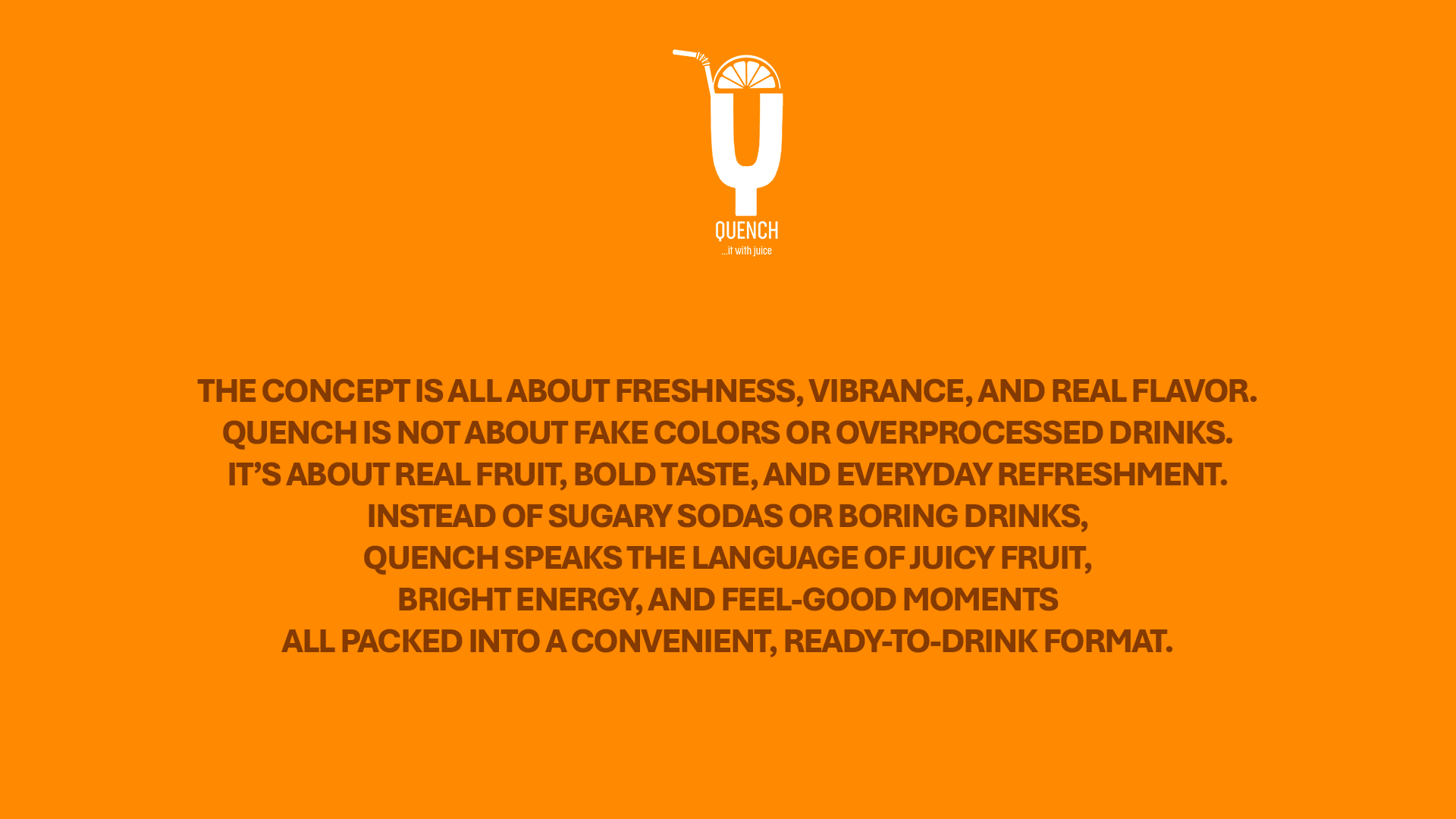
Direction
Fruit leads the direction
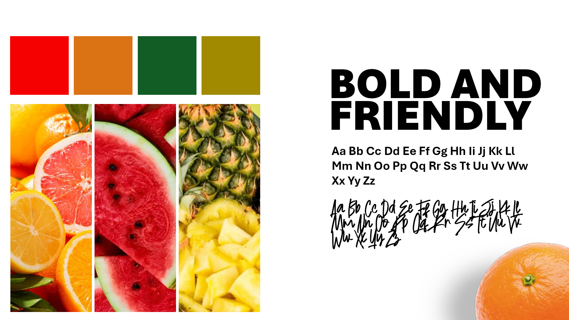
Deep green grounds the brand while fruit-led color, photography, and expressive type bring the flavor forward. A fixed layout keeps the range easy to recognize.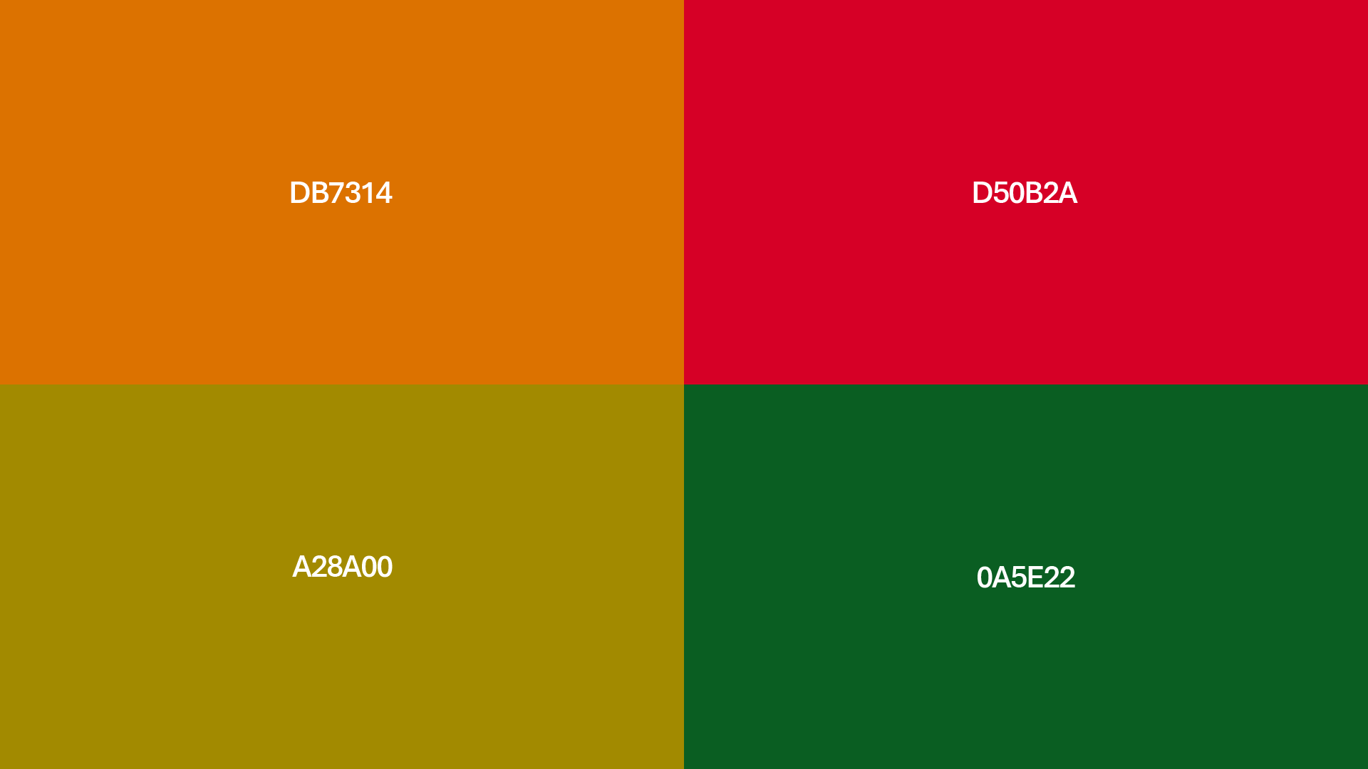
Logo
A glass hidden in the Q
The mark turns the letter Q into a glass, finished with a straw and citrus slice. It is simple enough to hold its own beside the vivid fruit imagery.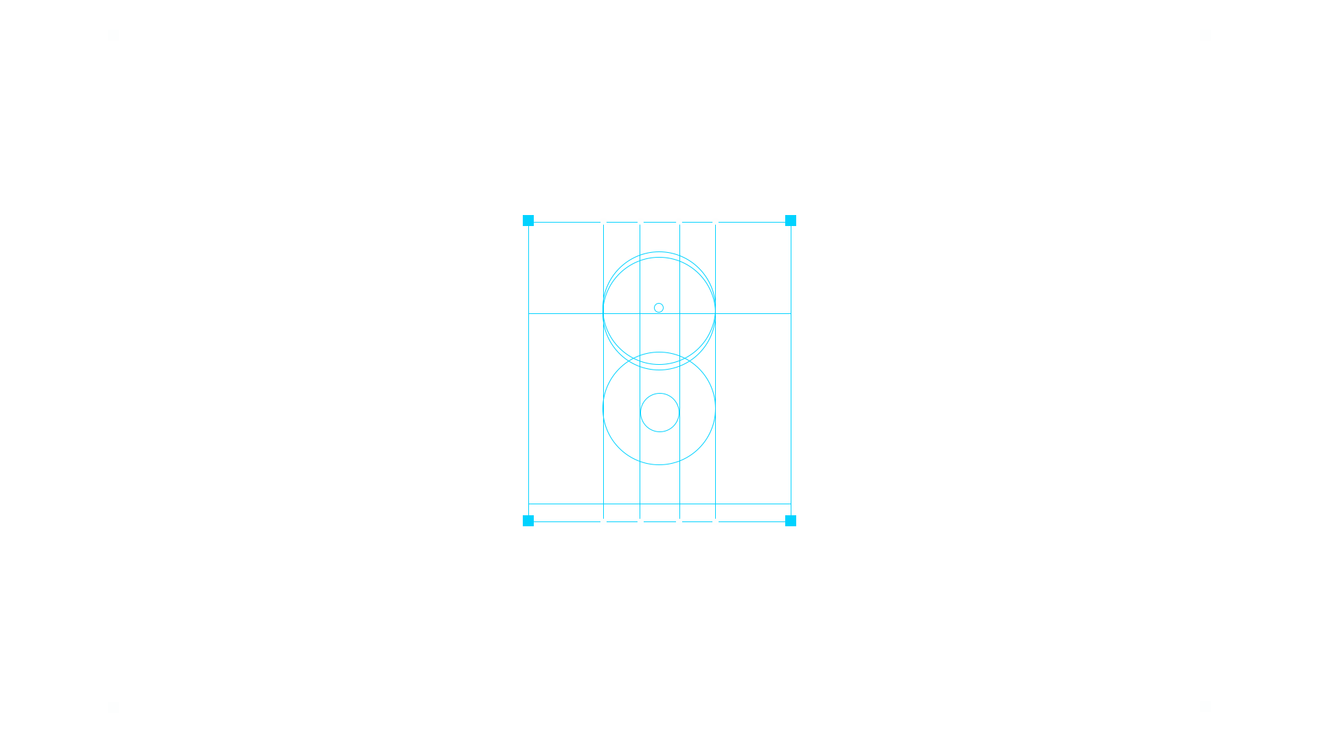
Packaging
A shared carton, built to flex
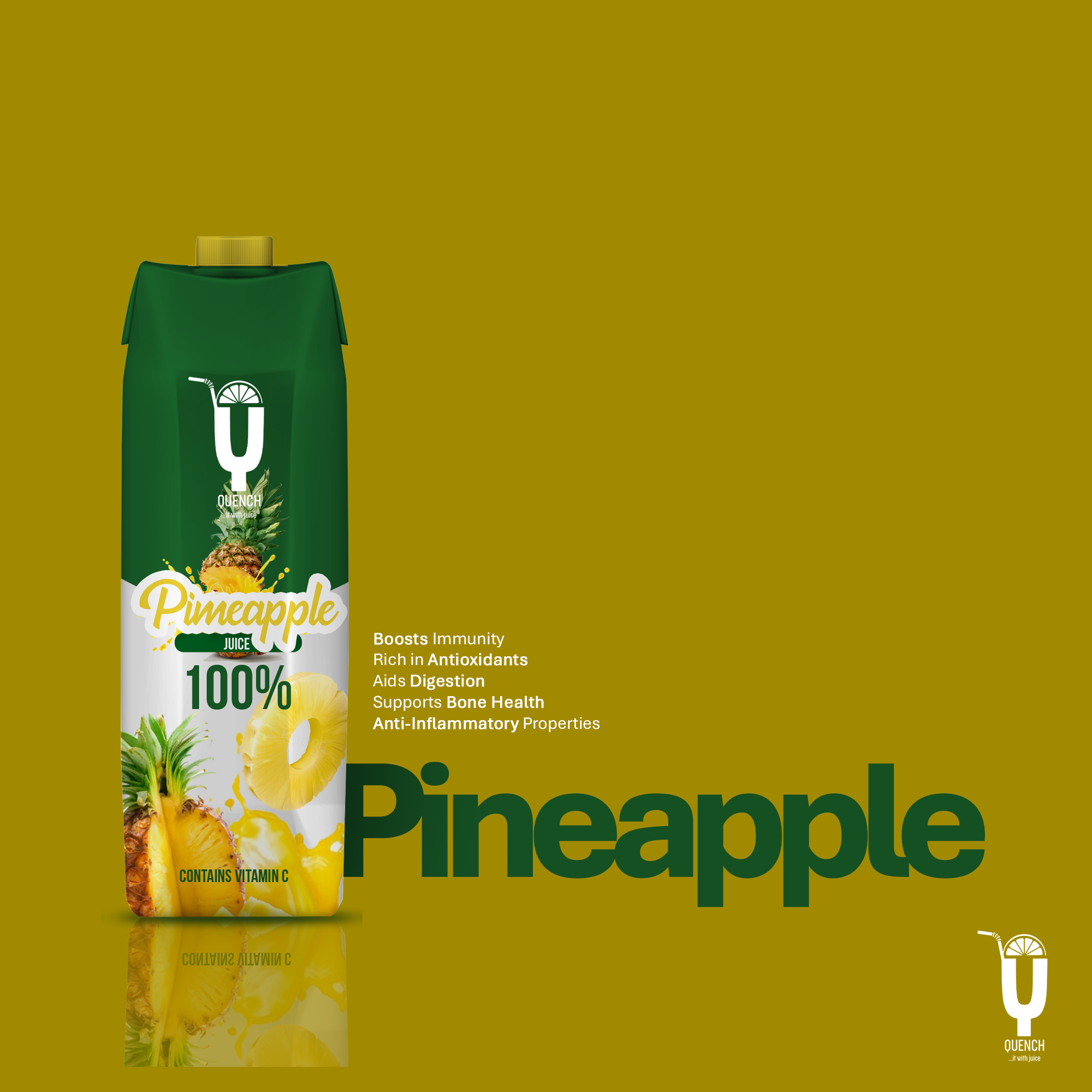
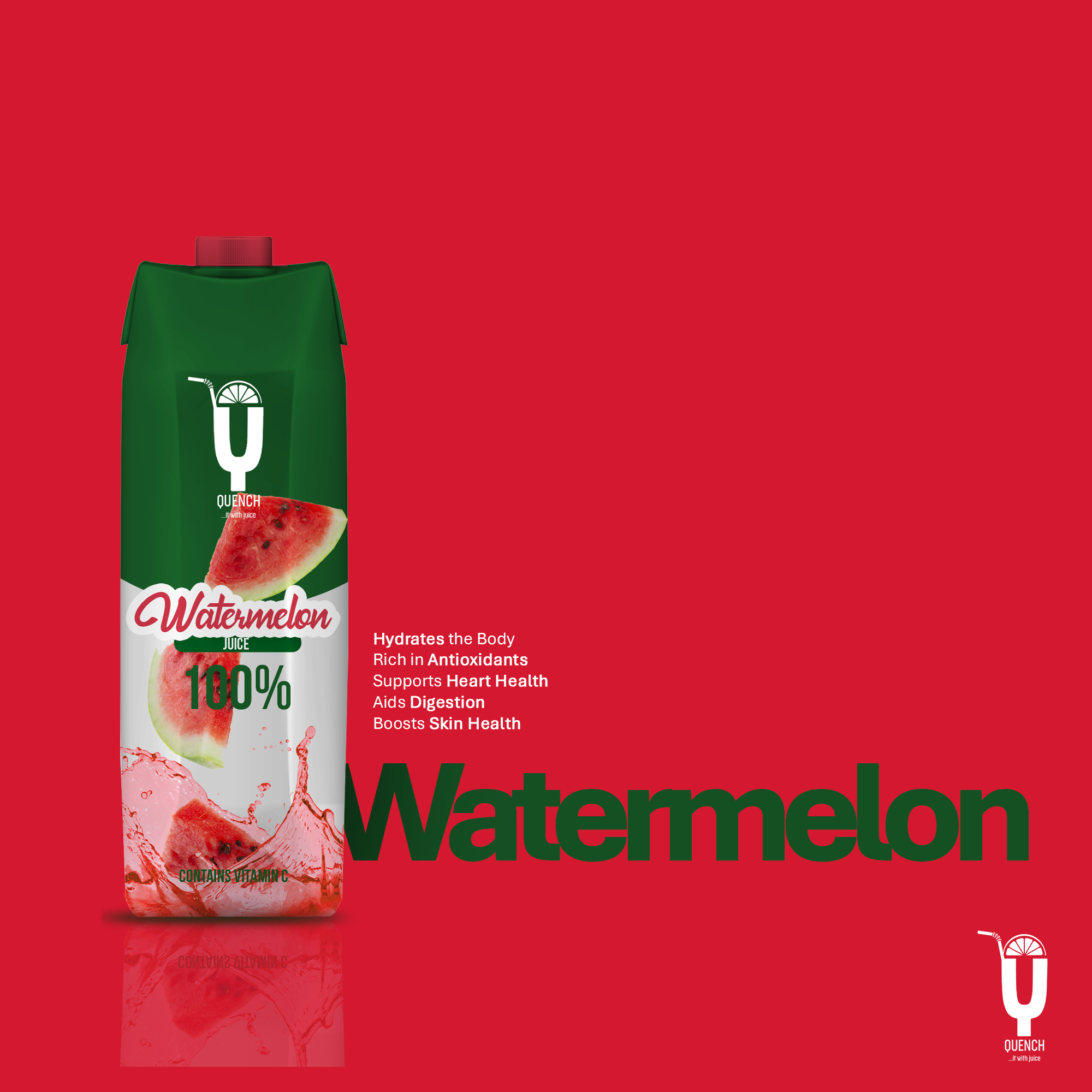
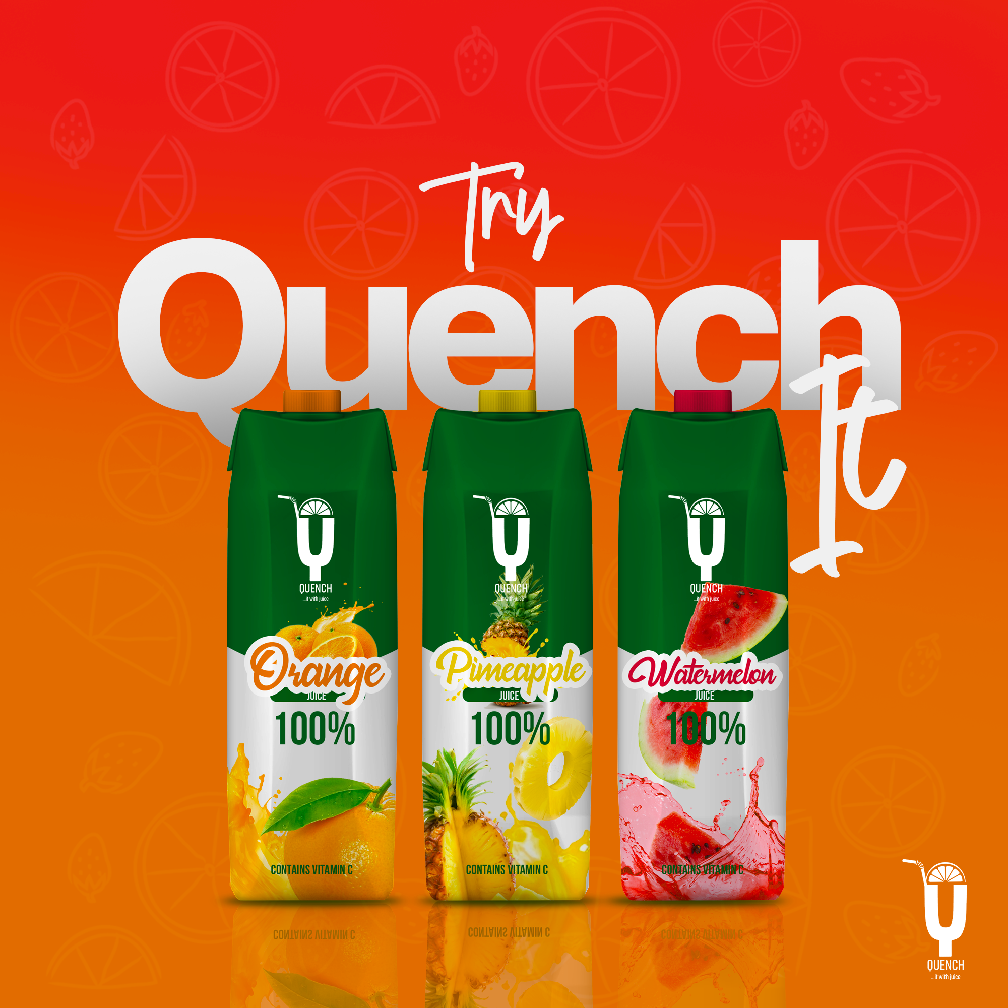
Each carton follows the same rhythm: green brand block, handwritten flavor name, and fruit in motion. Changing only the fruit and accent color makes the range consistent without feeling repetitive.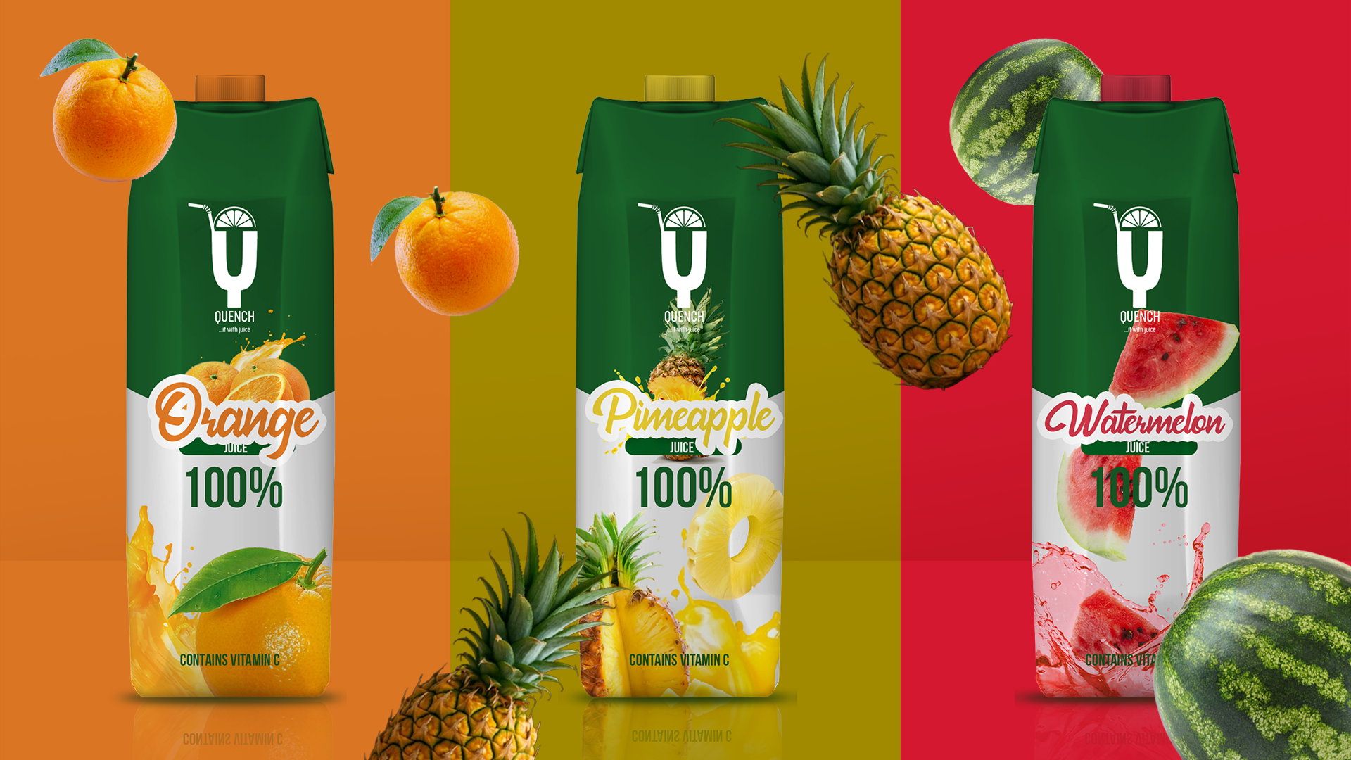
Flavors
Flavor becomes the personality
Orange feels warm, pineapple turns tropical, and watermelon brings a sharp red contrast. Together, the three cartons read as one bright, confident range.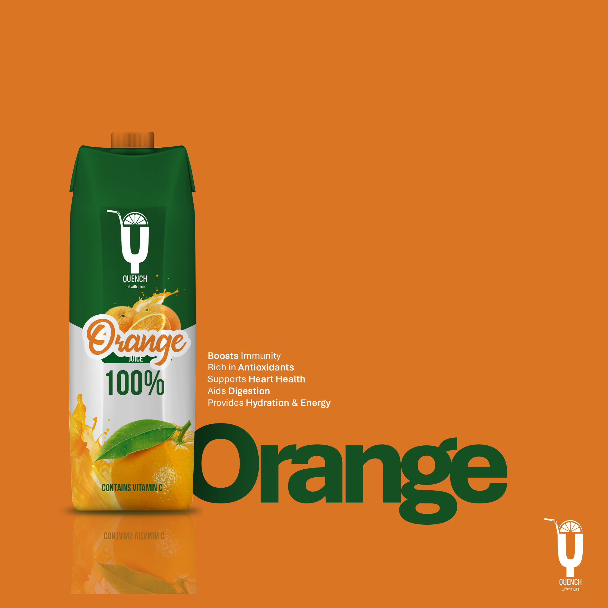
Brand Applications
The mark leaves the shelf
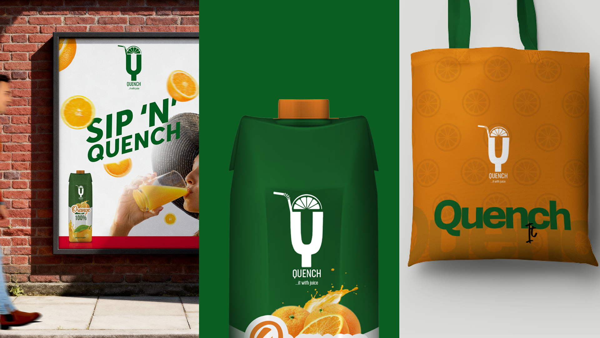
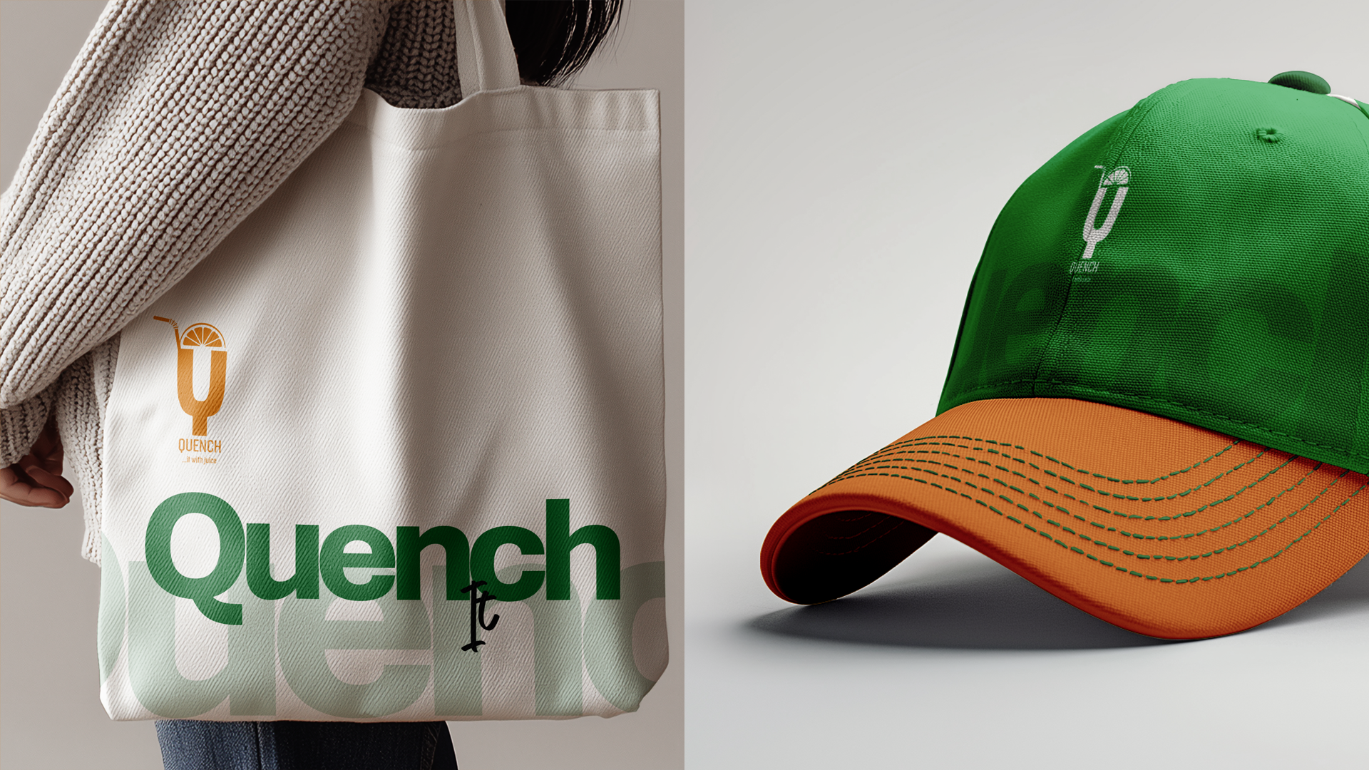
The glass-shaped Q moves easily onto mugs, shirts, bags, and caps. Oversized letterforms turn the identity into a playful pattern beyond the carton.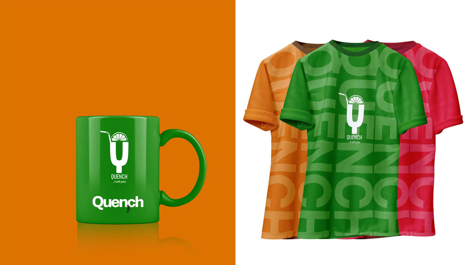
Promotion
Fruit, splash, product
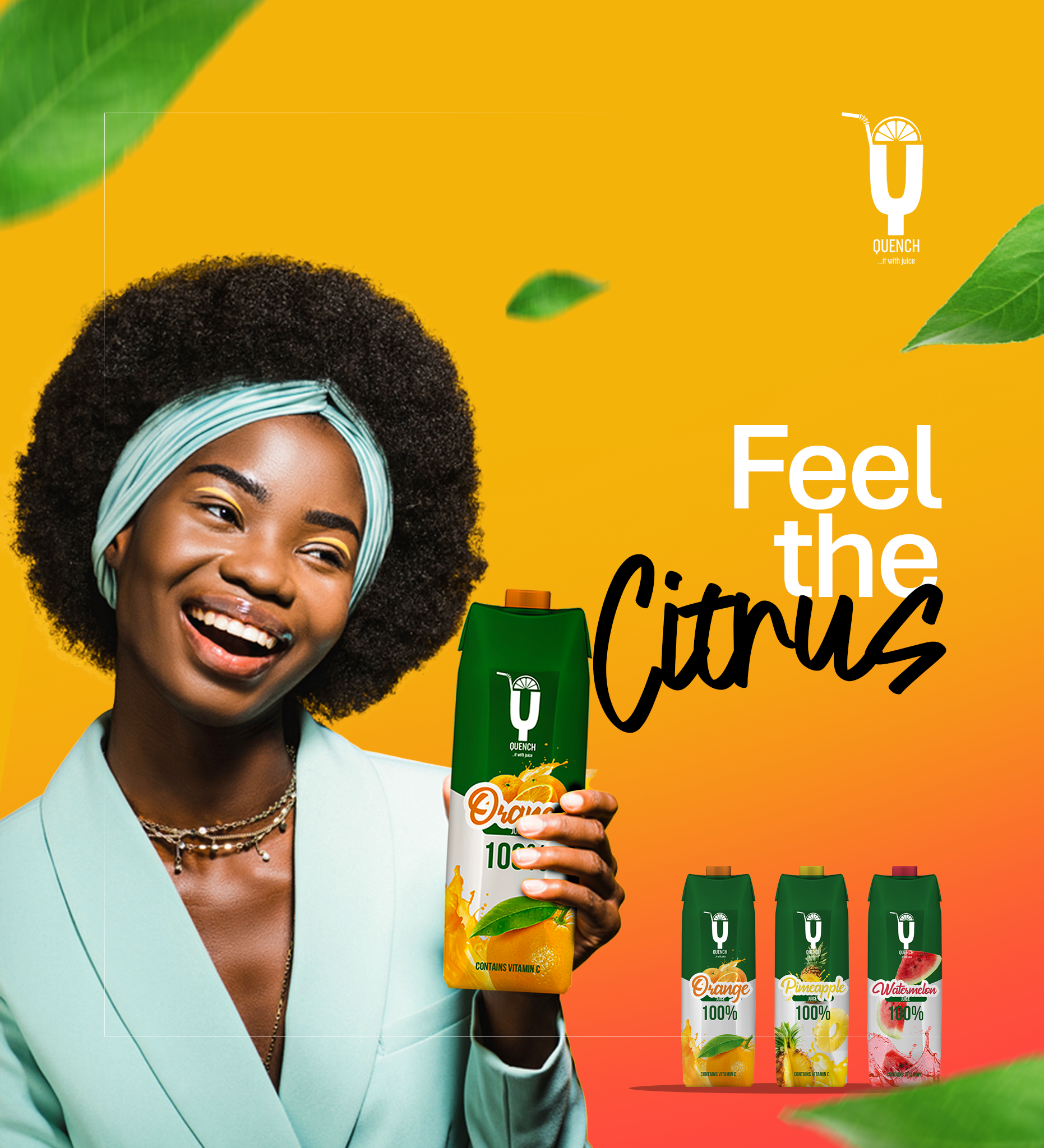
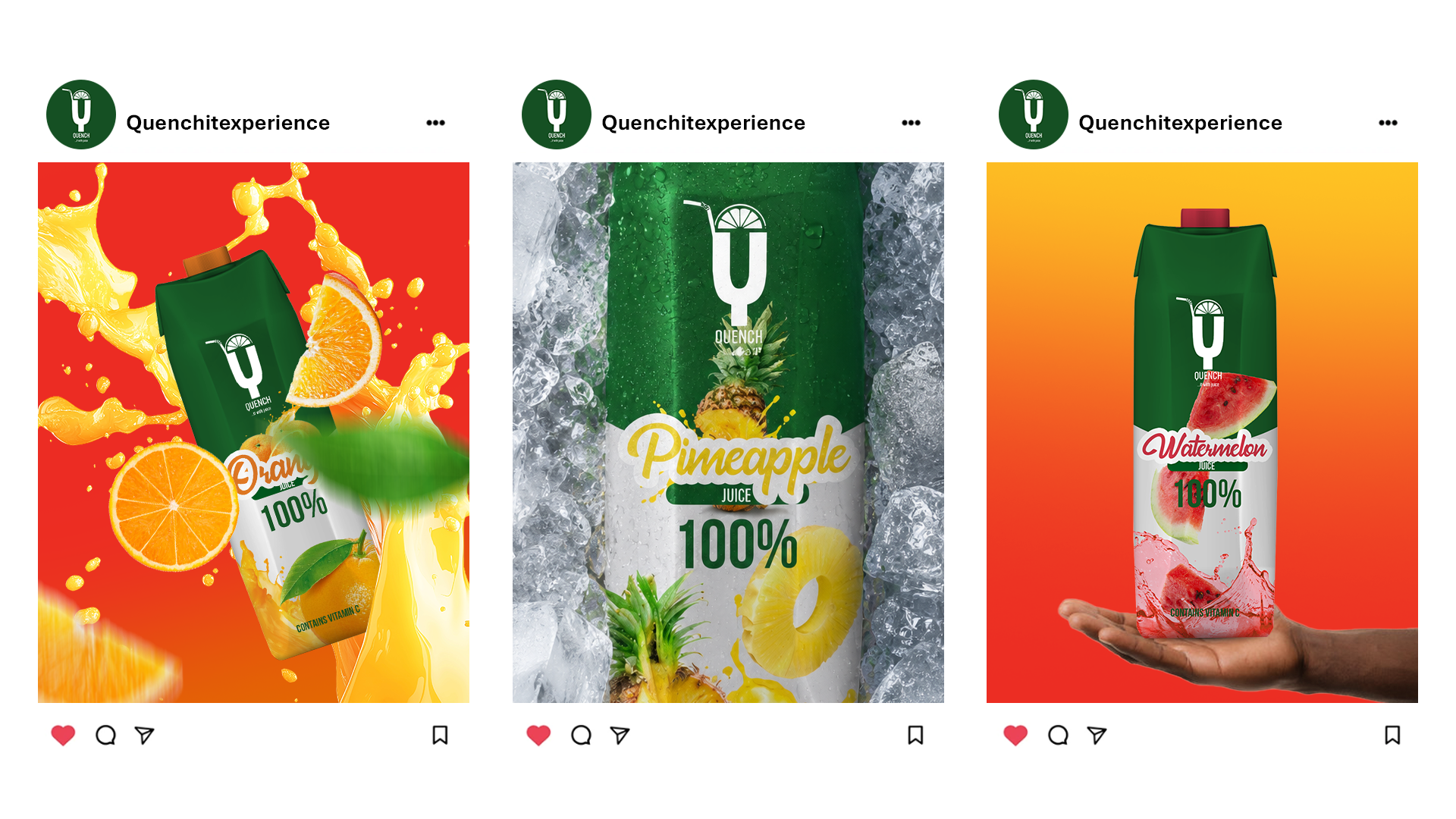
The campaign brings the packaging language into motion: floating fruit, liquid splashes, cold textures, and clear product moments made for posters and social feeds.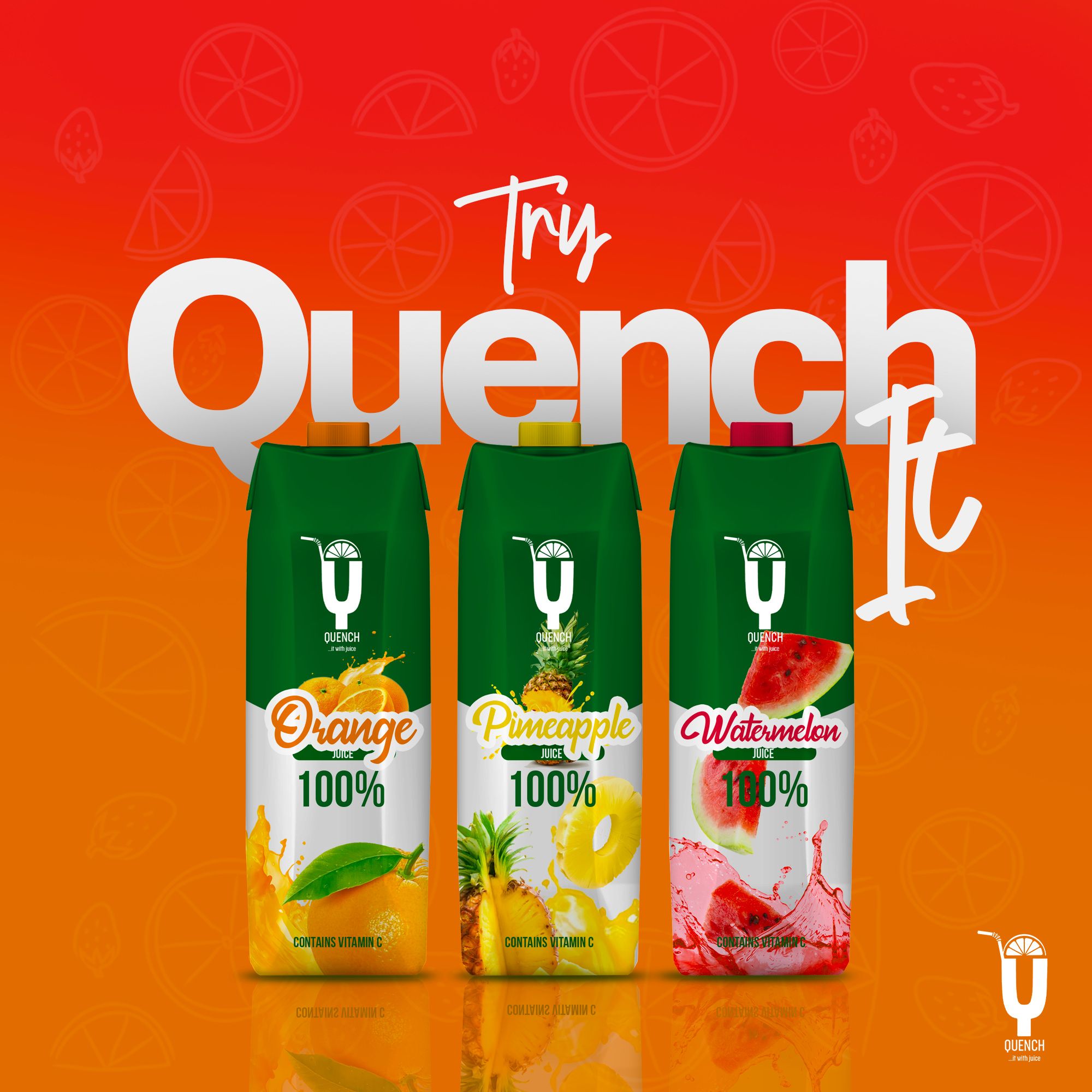
Outcome
Bright, flexible, unmistakably Quench
What began with a simple Q becomes a full visual world. Across packaging, merchandise, and promotion, the result stays fresh, energetic, and easy to recognize.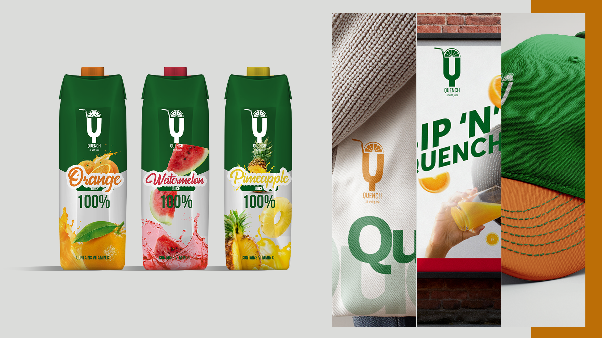
Next - 002 / Projects
Pepsnspy→Available to work