
002 / Brand Identity / Packaging Design
Peps n Spy
Peps n Spy is a bold spice brand identity built around heat, flavour, strong product presentation, and a bright food-focused visual system.
- Brand
- Peps n Spy
- Role
- Brand, Packaging & Campaign Designer
- Focus
- Logo, packaging, product visuals, and brand presentation.
- Style
- Bold / Spicy / Food-focused
- Assets
- Logo, typography, brand colors, packaging, product mockups, and lifestyle product visuals.
- Direction
- A flavour-driven identity using peppers, herbs, spices, strong red accents, and clean product packaging.
Logo
A bold mark built from spice and flavour
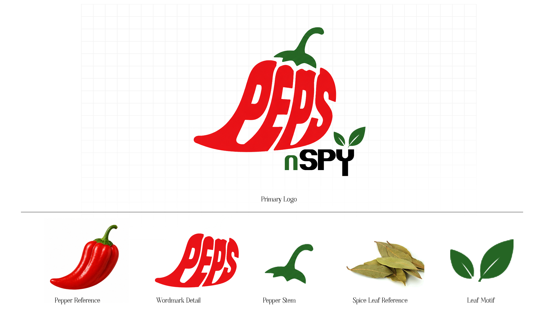
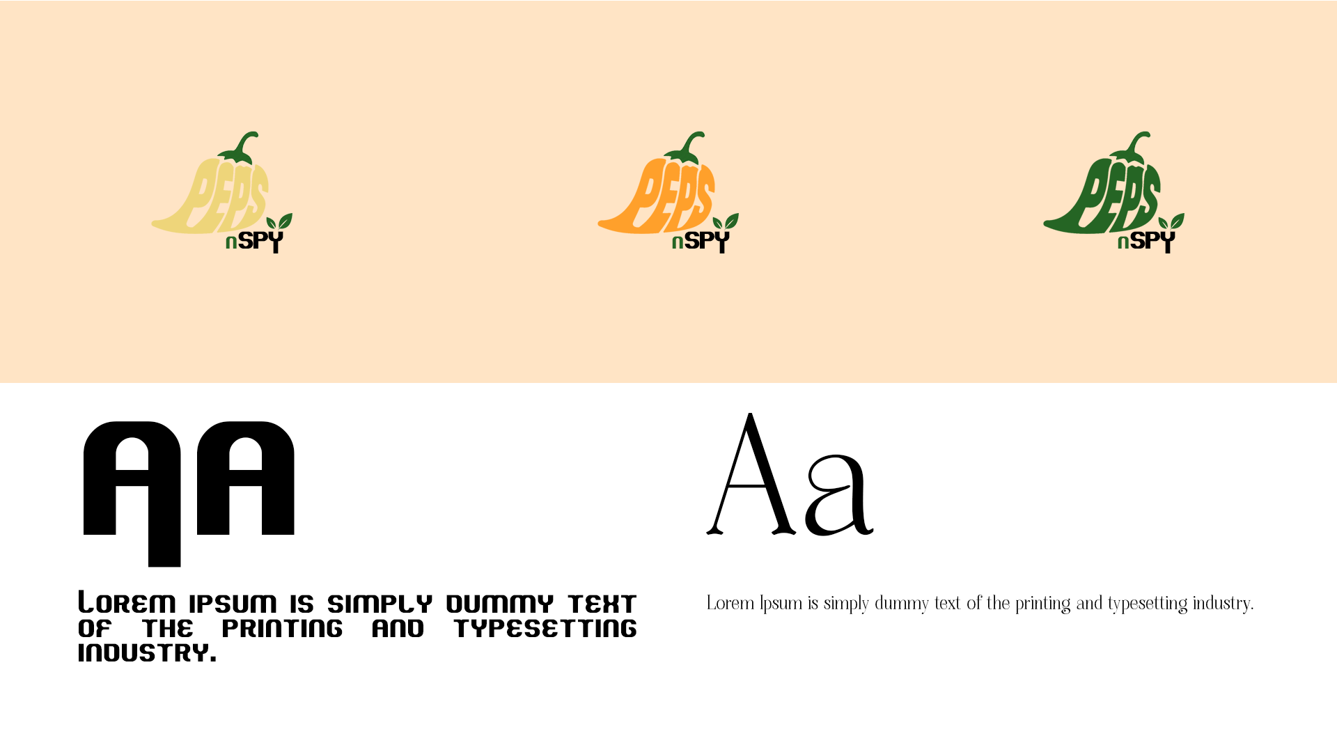
The Peps n Spy logo uses pepper-inspired shapes, bold lettering, and a playful food identity to make the brand feel spicy, energetic, and easy to recognize. The logo variants and typography direction help the identity stay flexible across packaging and campaign visuals.
Brand Colors
A palette inspired by ingredients
The color system connects the brand to real food ingredients such as peppers, spices, garlic, and herbs. This helps the identity feel natural, flavourful, and directly connected to the product.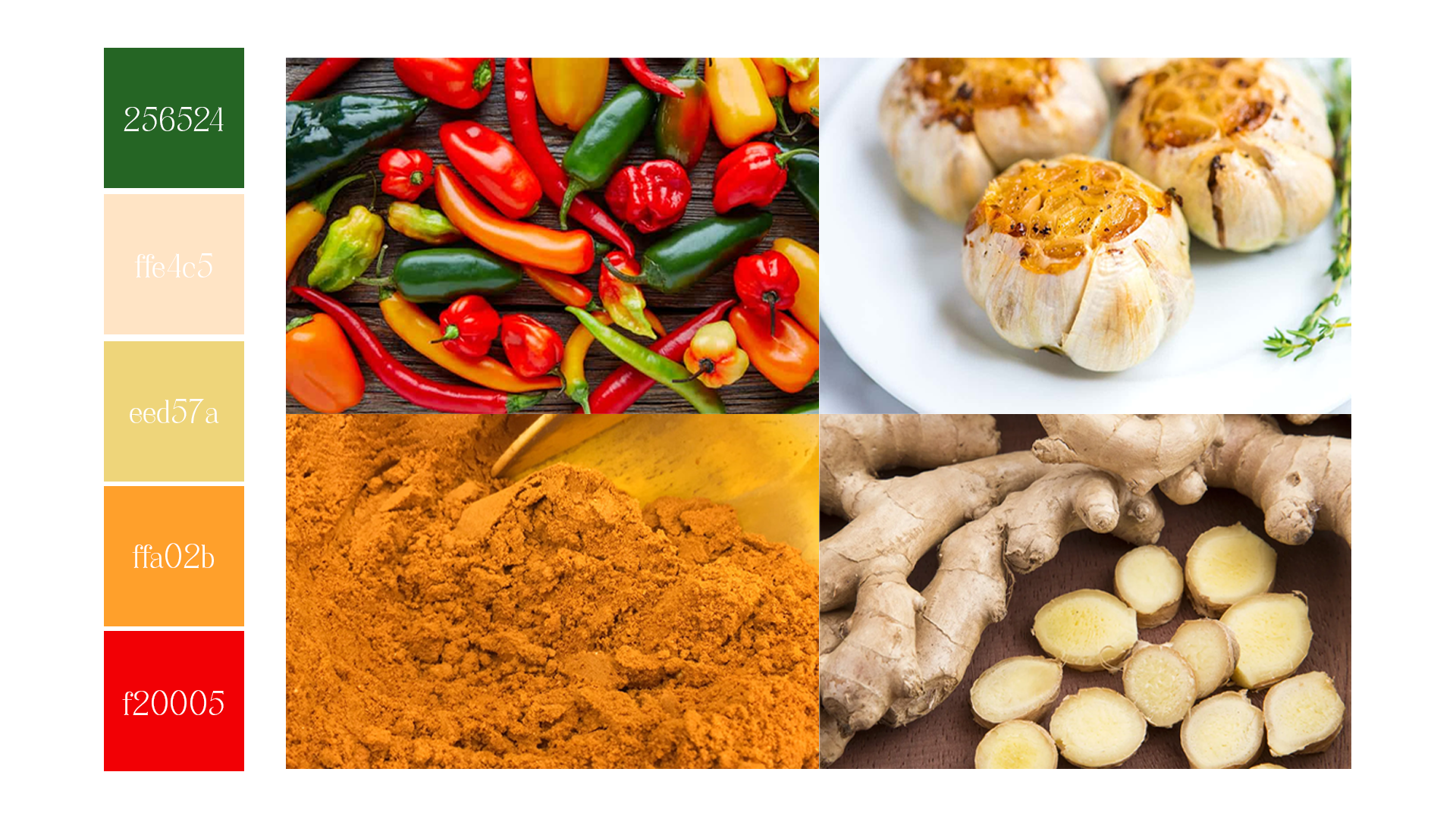
Packaging
A product system for different spice flavours
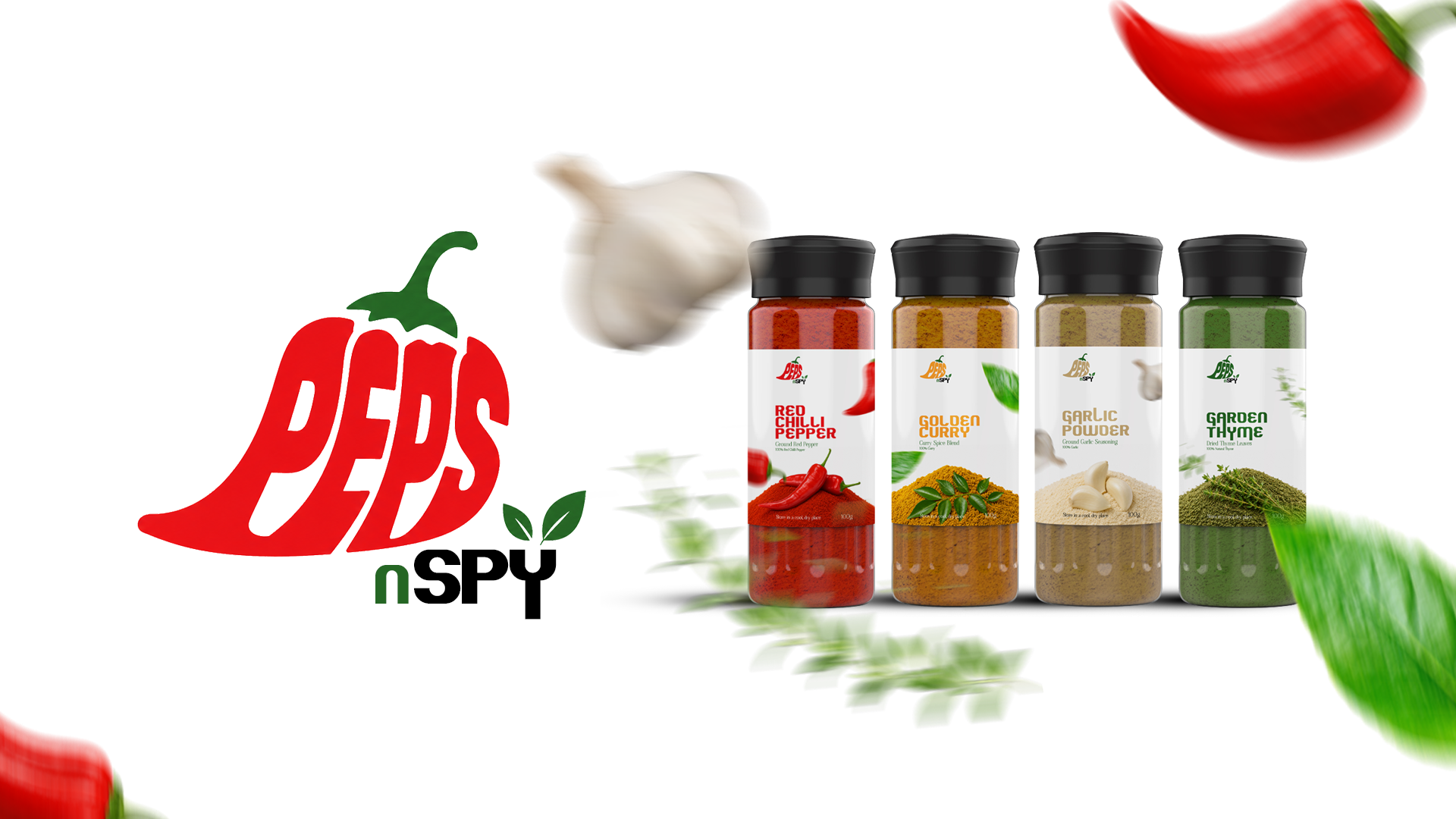
The packaging system shows how the identity can work across a set of spice products. The four-in-one package creates a clear product family while still allowing each flavour to stand apart.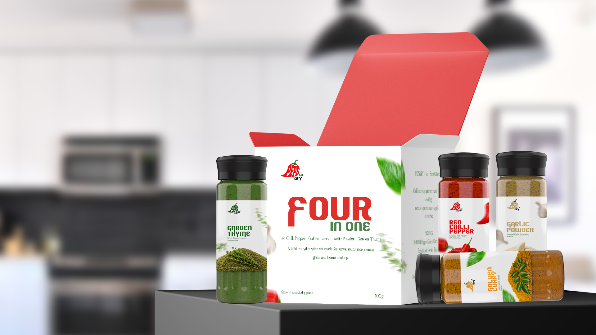
Product Line
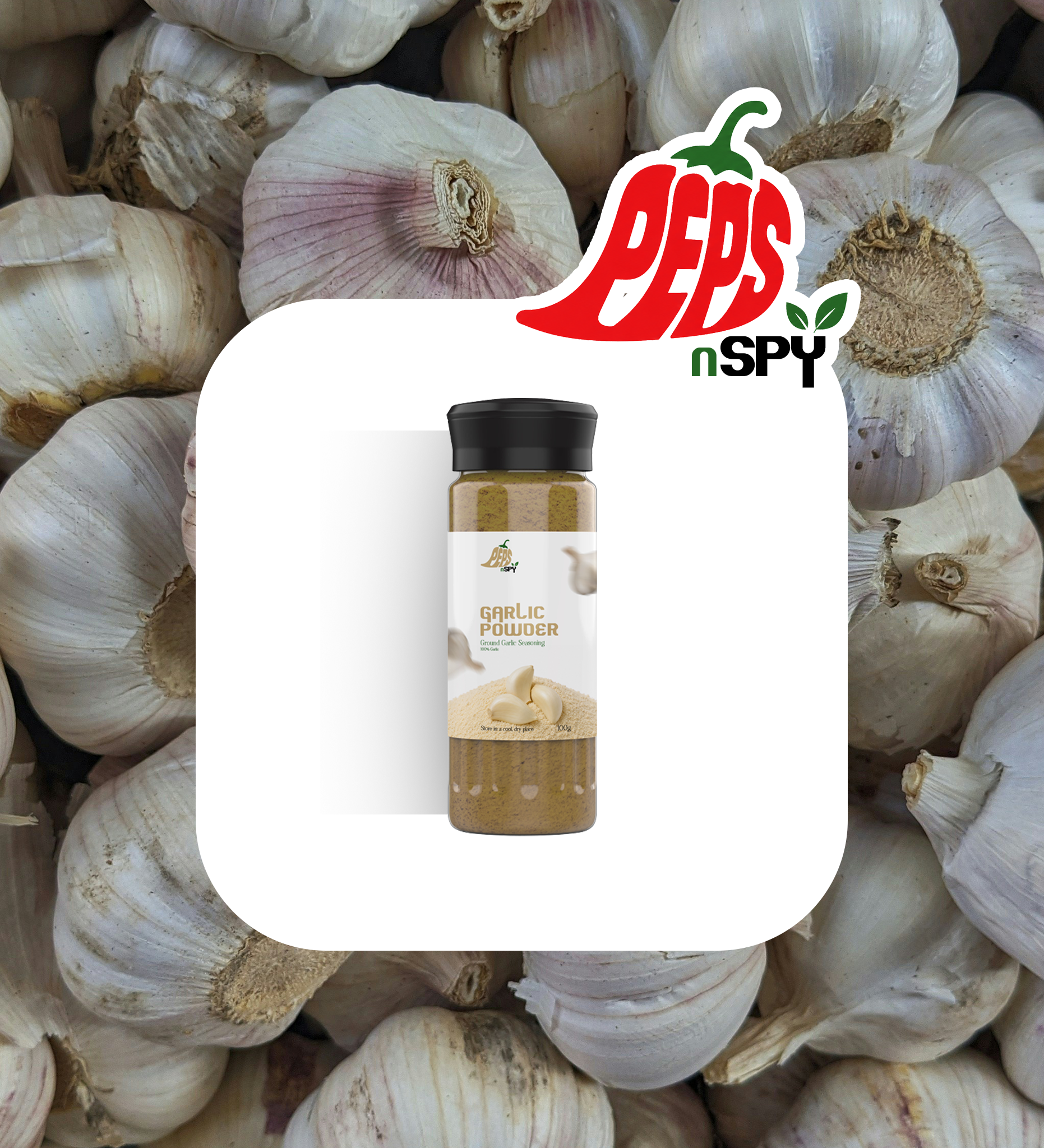
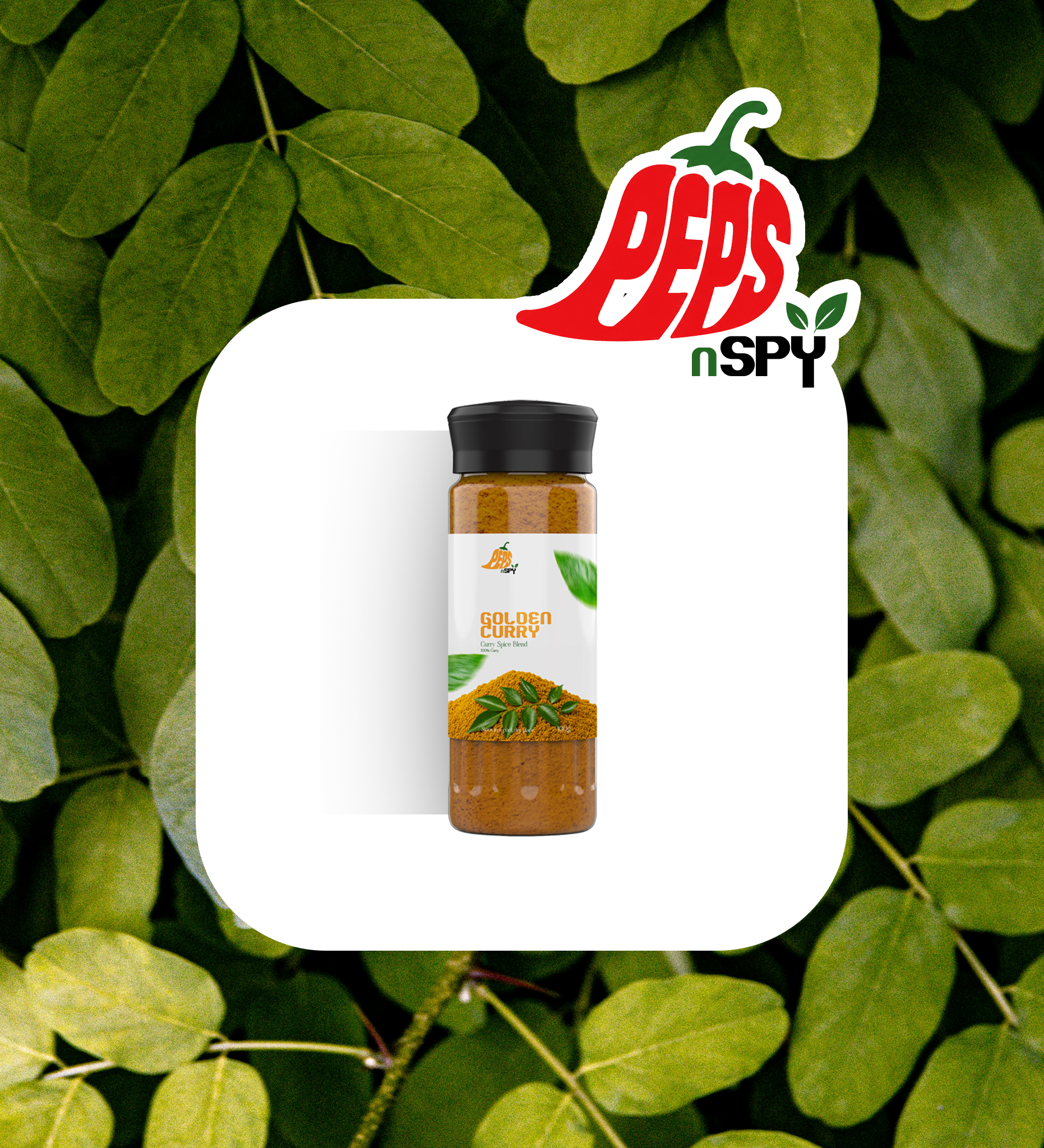
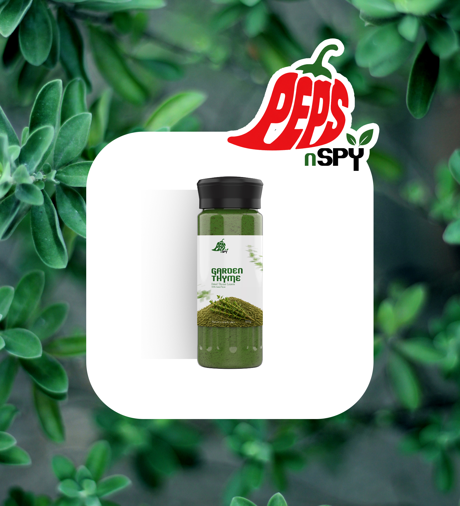
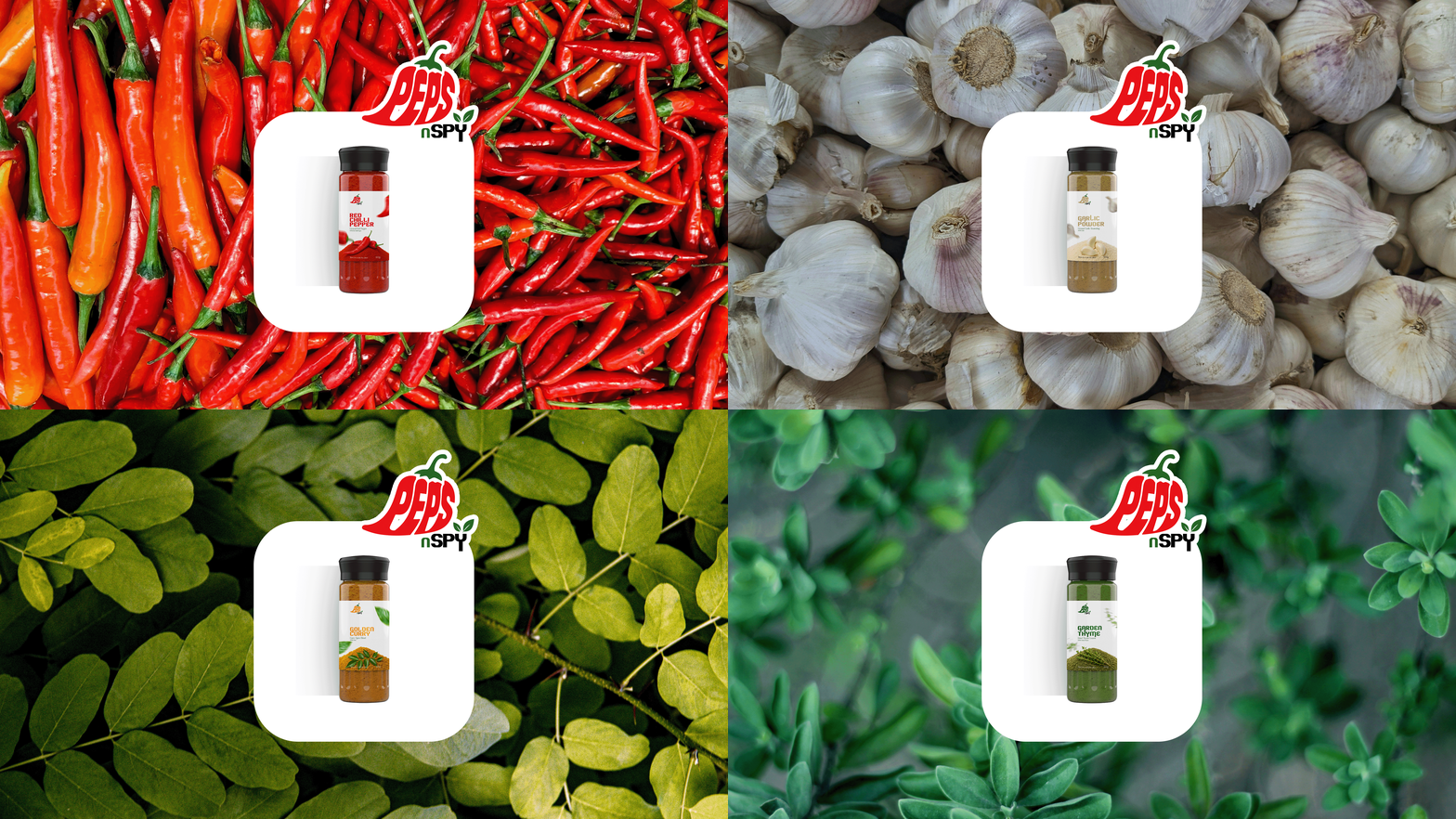
Showing each flavour as its own product moment
The individual product visuals use ingredient backgrounds to give each bottle its own flavour personality. The designs keep the same brand structure while changing the mood through peppers, garlic, herbs, and spice imagery.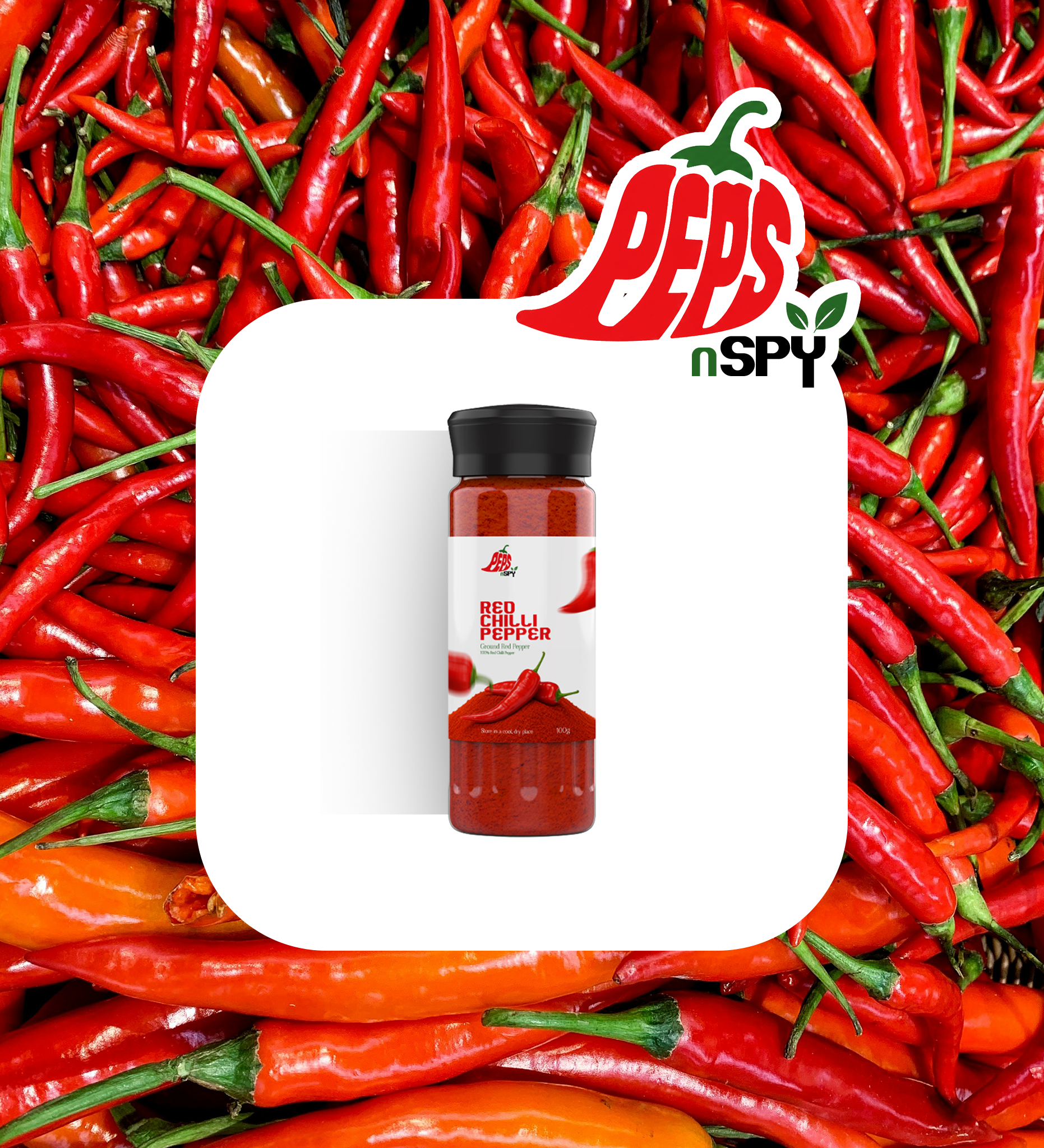
Product in Use
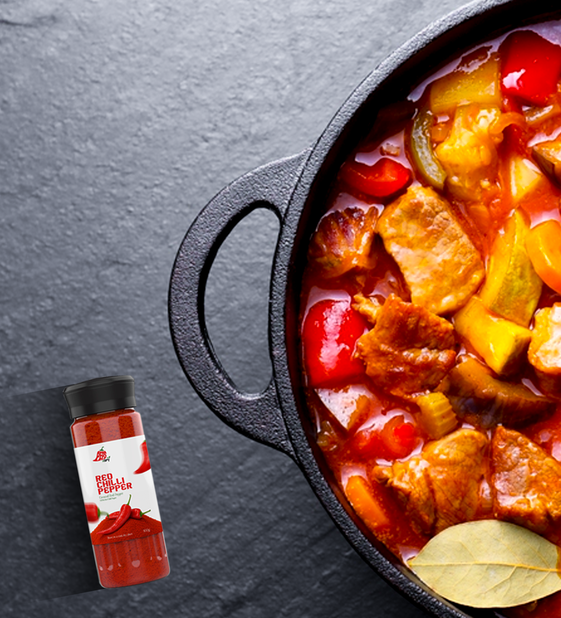
Placing the spice brand in real cooking moments
These lifestyle visuals show how Peps n Spy can appear in everyday cooking spaces. By placing the spice bottles beside meals, kitchen scenes, and food preparation moments, the brand feels more practical, useful, and connected to real flavour experiences.

Product Campaign
A stronger visual push for flavour and energy
The product campaign design adds more movement and flavour energy to the brand. It uses flying ingredients, bold red type, and product imagery to communicate the idea of strong spice and intense taste.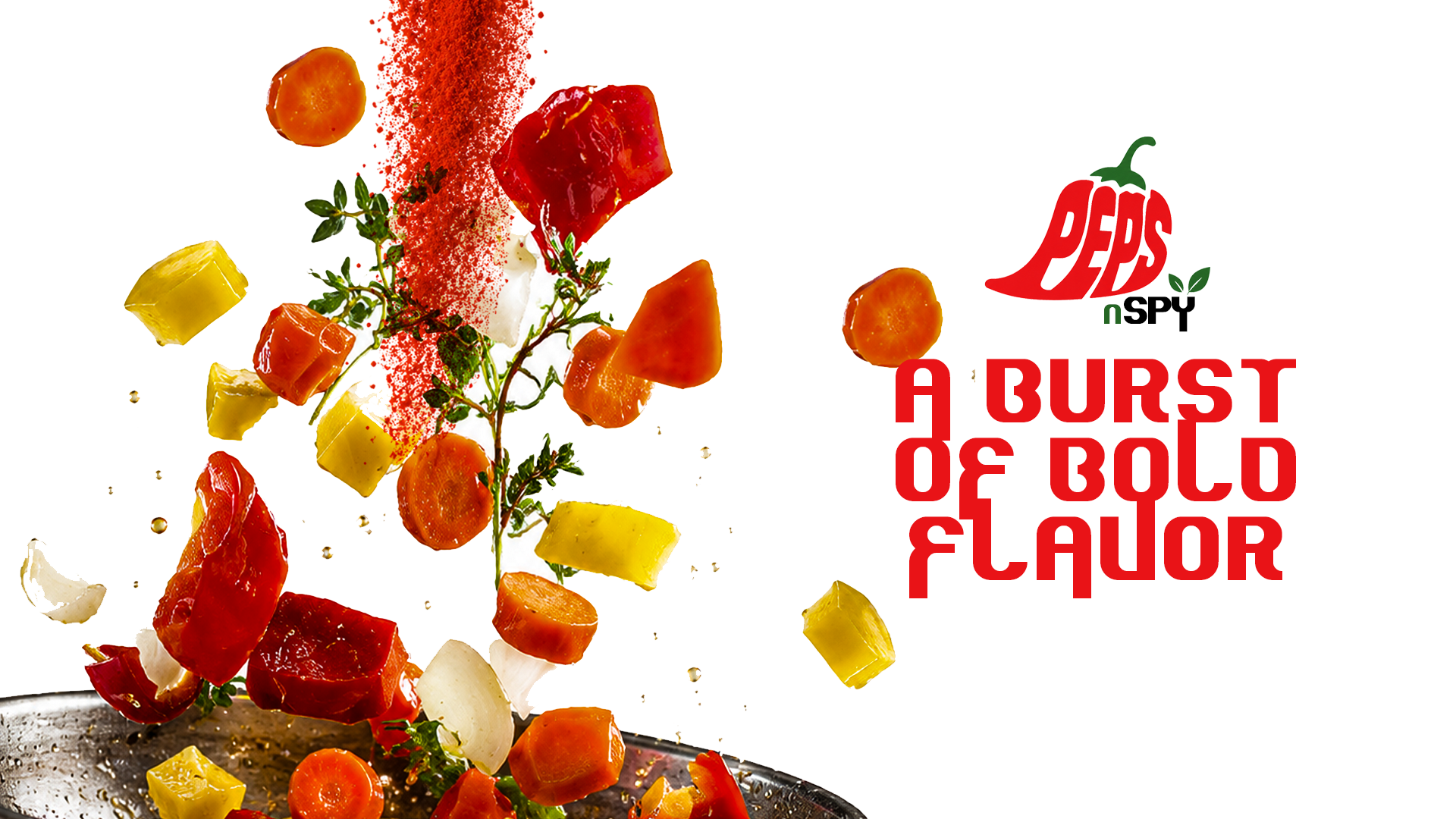
Outcome
A complete spice brand system
The final Peps n Spy identity connects logo design, typography, colour, packaging, product visuals, lifestyle applications, and campaign-style graphics into one bold food brand system. The result is a bright, spicy, and flexible identity that can work across packaging, digital promotion, and real product use.Logo
Typography
Brand colors
Packaging
Product visuals
Lifestyle applications
Campaign graphics
Next - 003 / Projects
Logo Design Collection→Available to work