
004 / Brand Identity / Campaign Design
Maple Mischief
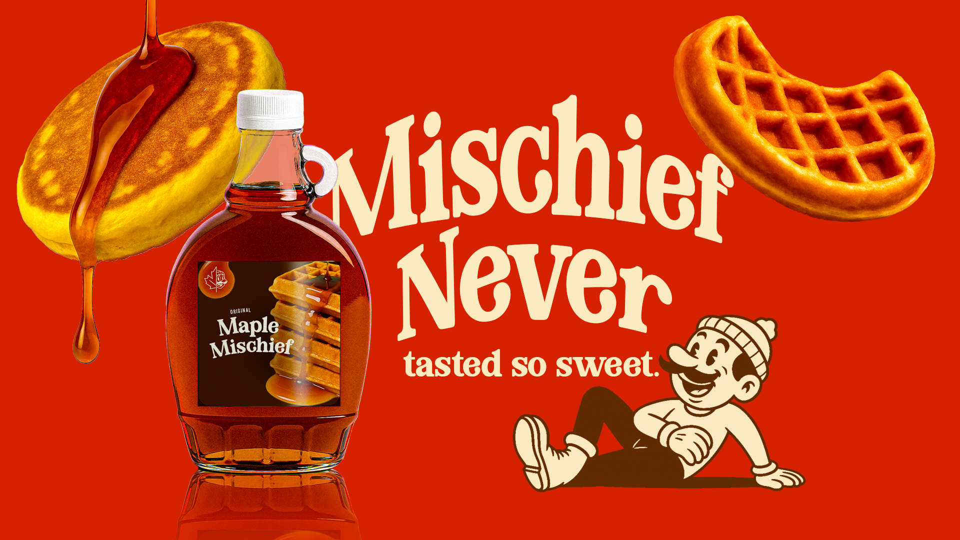
Maple Mischief is a playful syrup brand built around bold campaign messaging, warm breakfast visuals, and a mischievous retro mascot.
- Brand
- Maple Mischief
- Role
- Graphic Designer
- Focus
- Brand Identity / Advertising
- Style
- Playful / Retro / Bold
- Output
- Logo, bottle mockup, billboards, social posts, and wall graphics.
- Theme
- Breakfast syrup brand with mischievous campaign language.
Overview
A playful syrup brand with attitude
Maple Mischief was designed as a fun syrup brand with a bold visual personality. The project uses warm colors, playful copy, a retro mascot, and product-focused campaign graphics to make the brand feel memorable and energetic.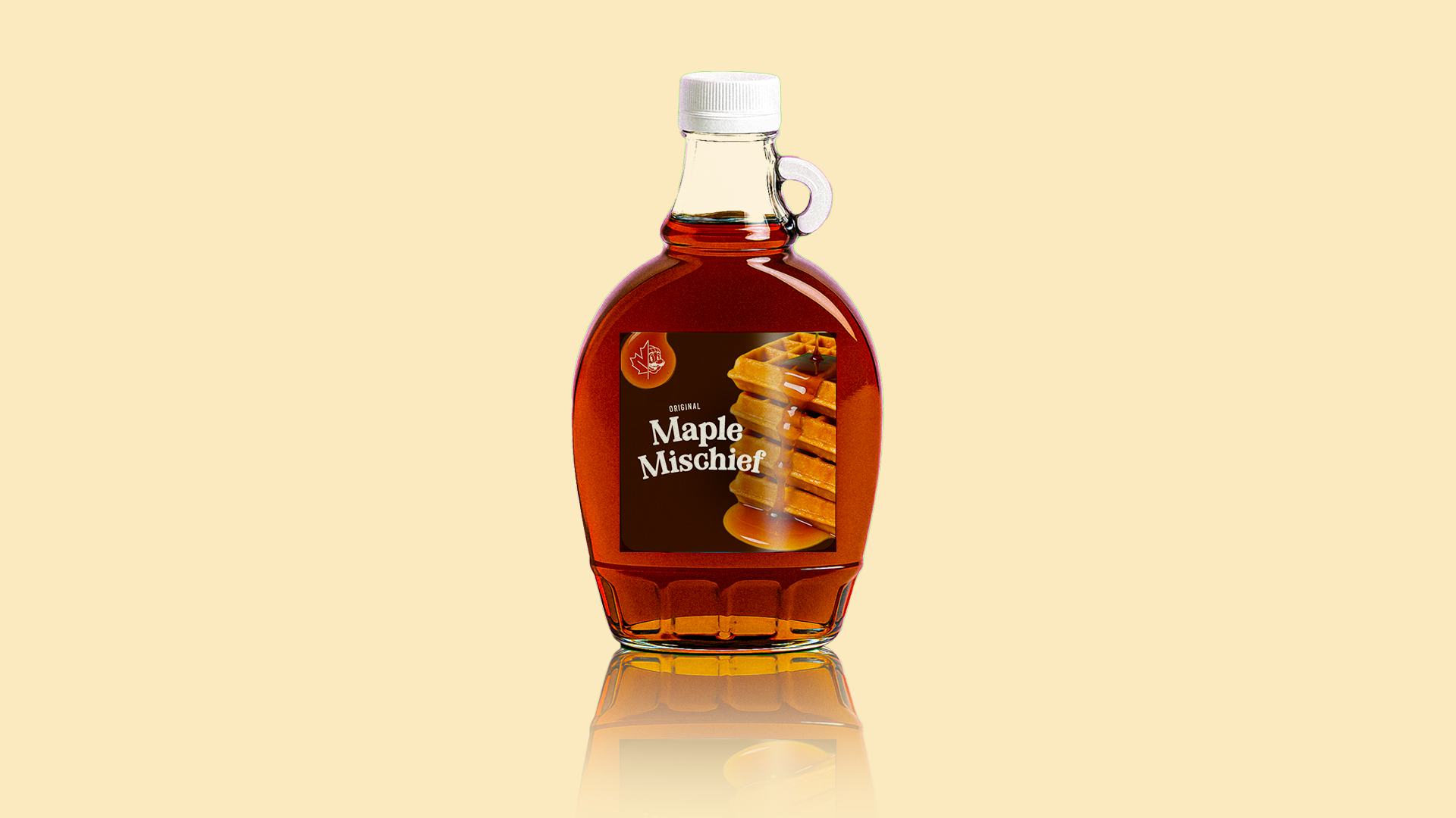
Logo
A character-led brand mark
The logo combines a maple leaf with a playful mascot face. This gives the brand a mischievous personality and makes the identity feel more memorable than a simple syrup label.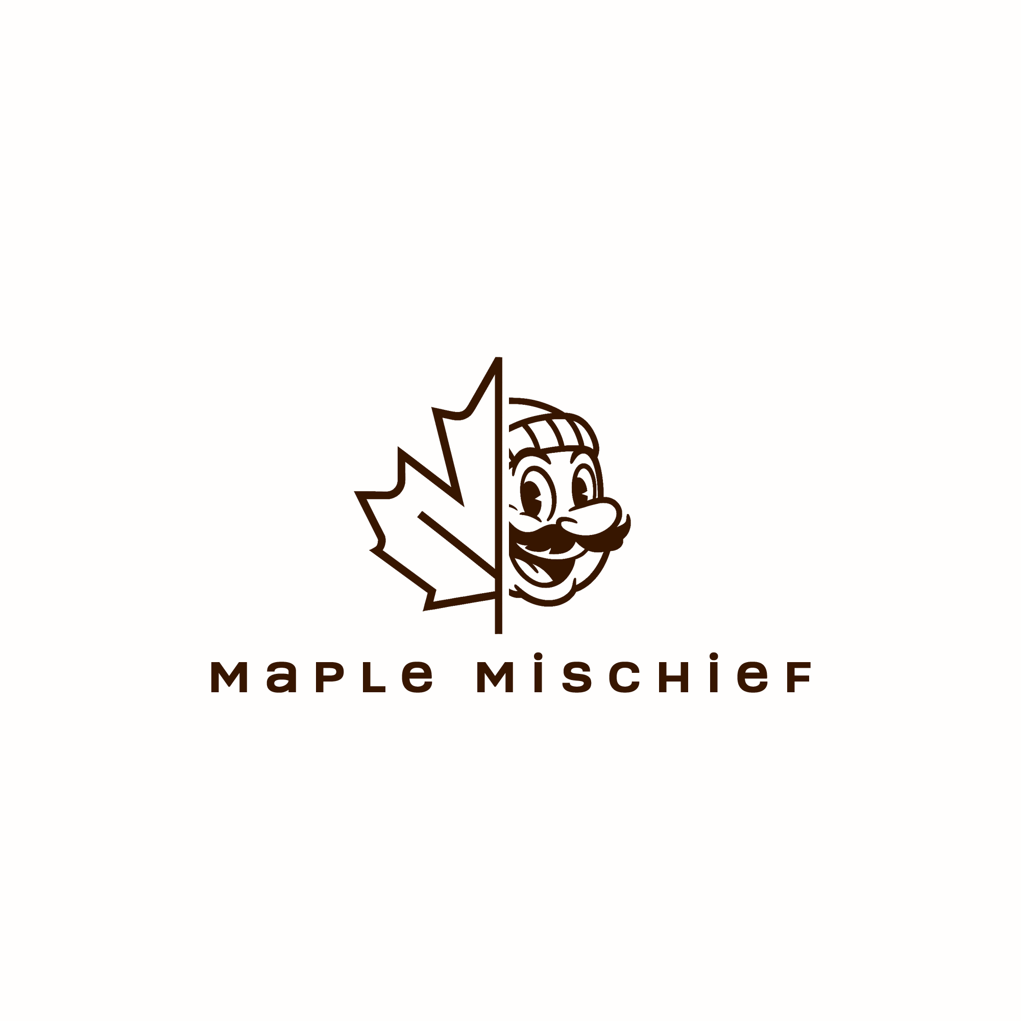
Social Graphics
Short, bold posts for quick attention
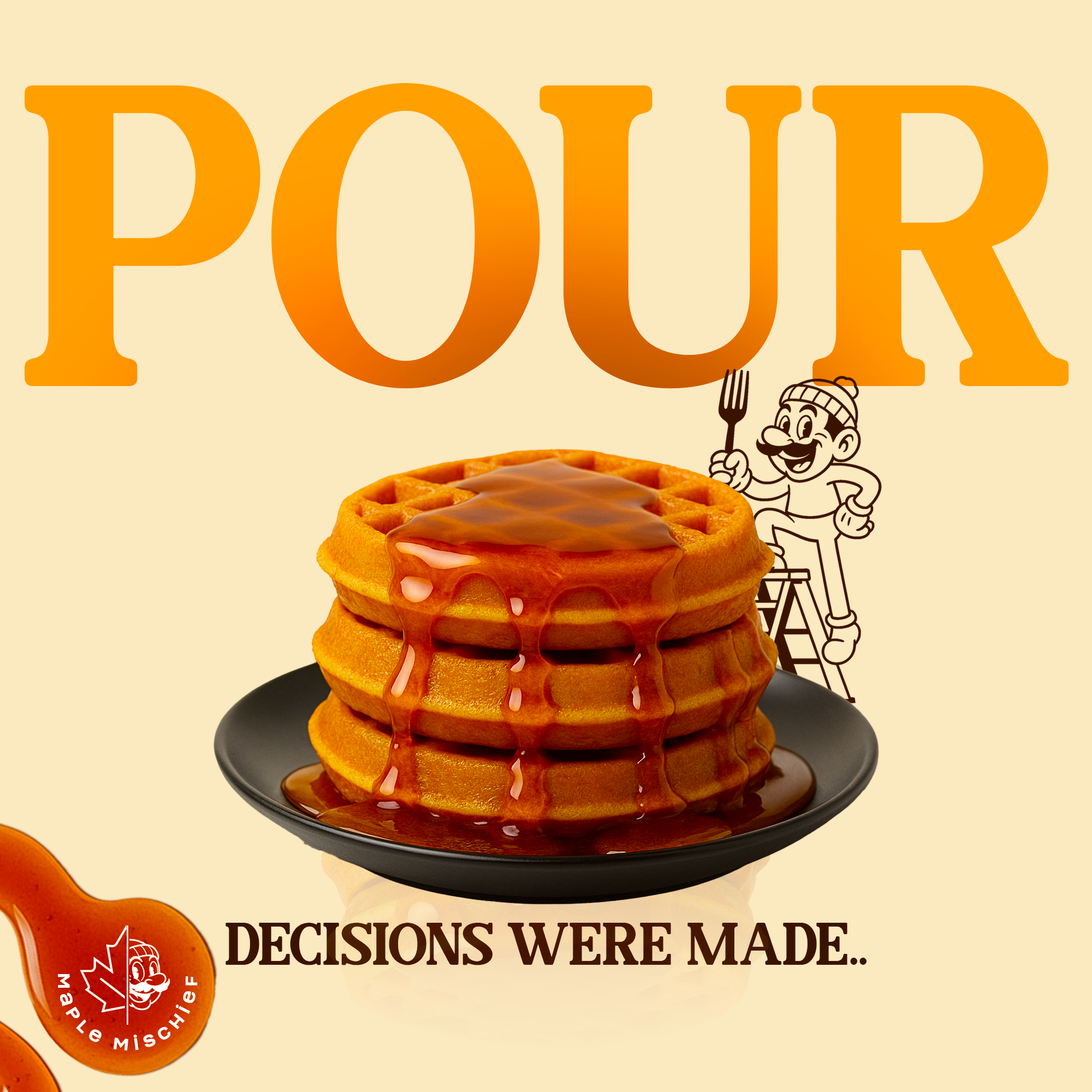
The social graphics use oversized type, syrup imagery, pancakes, waffles, and the mascot to create posts that feel fun and easy to remember.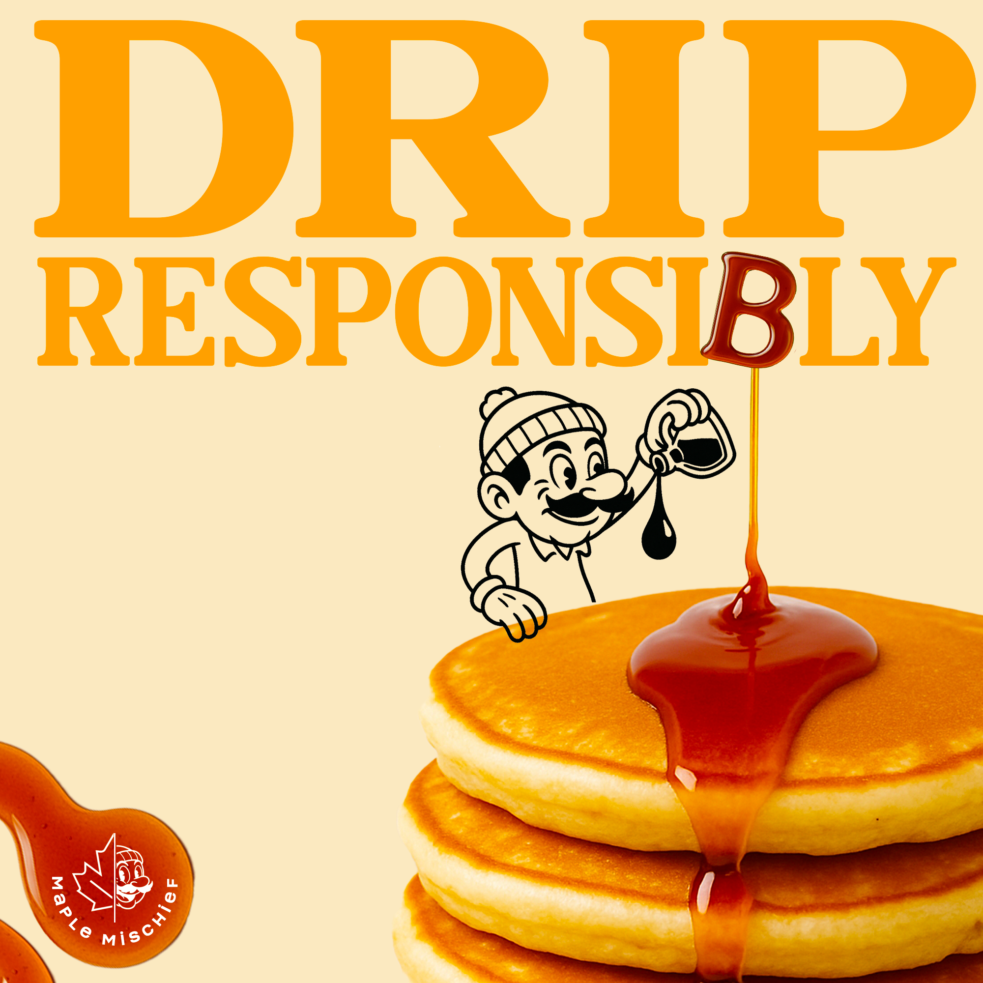
Billboards
Campaign lines made for outdoor ads
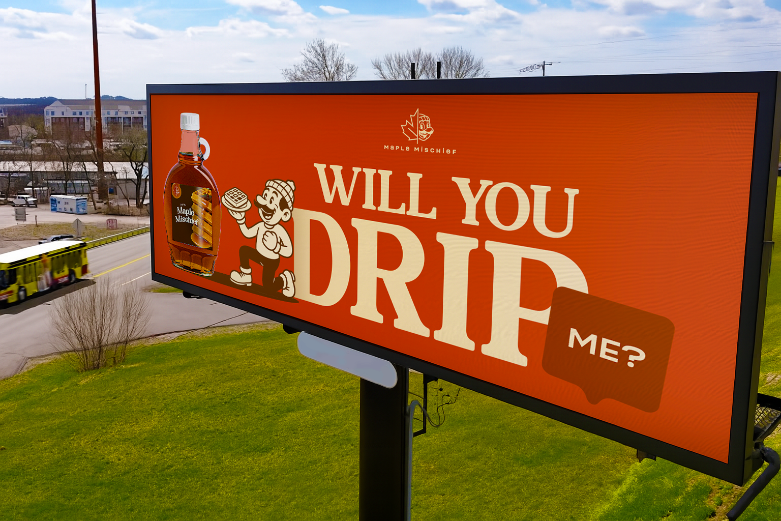
The billboard designs use simple headlines, strong contrast, and syrup-focused visuals. The goal was to make the message readable from a distance while keeping the playful Maple Mischief tone.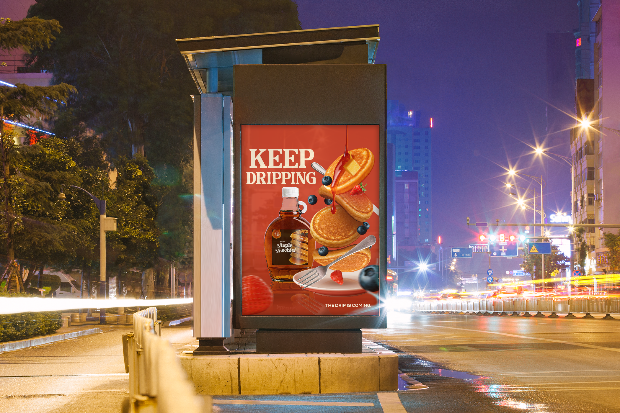
Wall Graphics
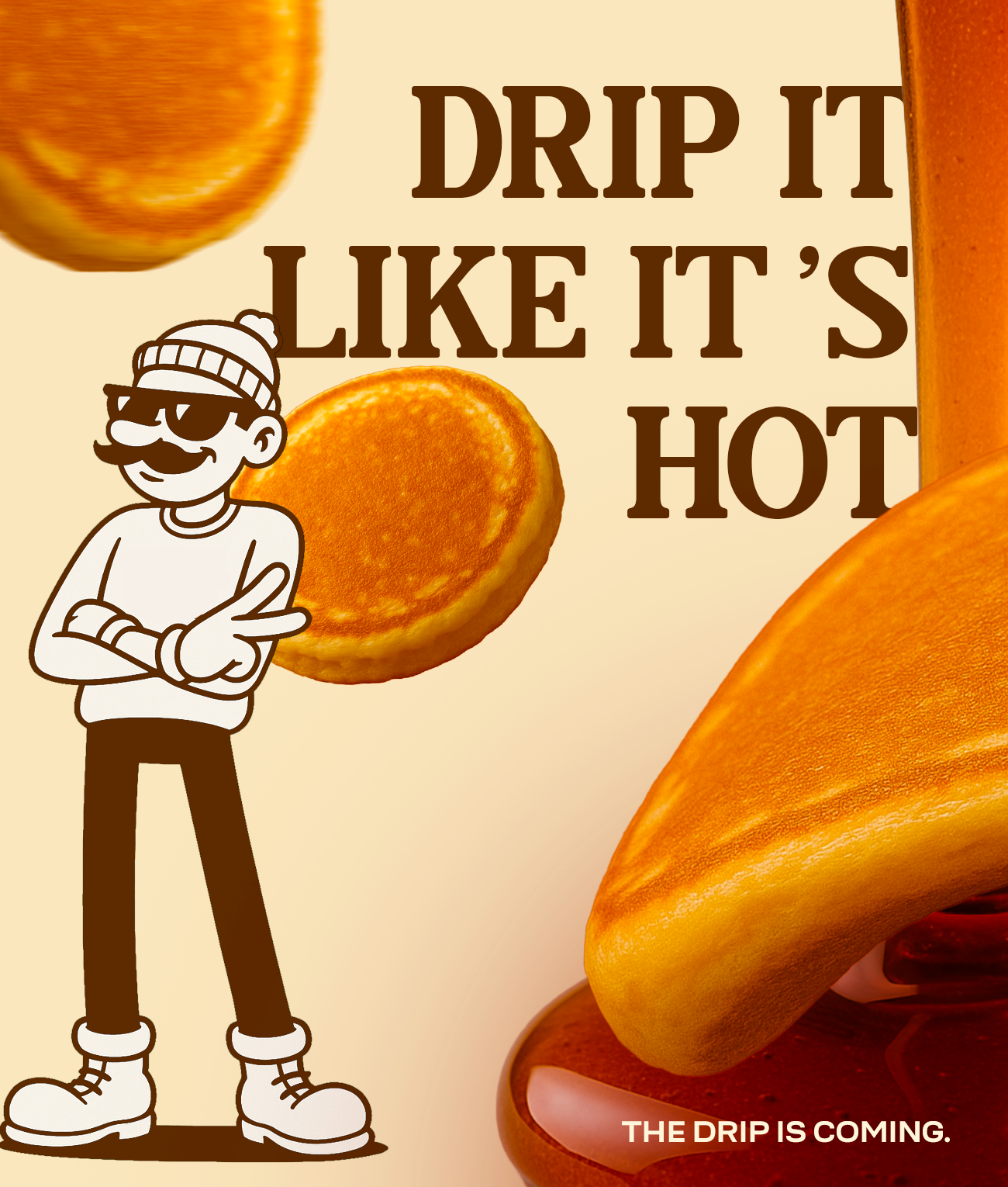
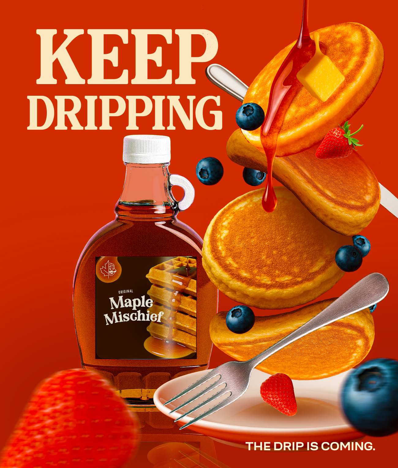
Posters with playful breakfast copy
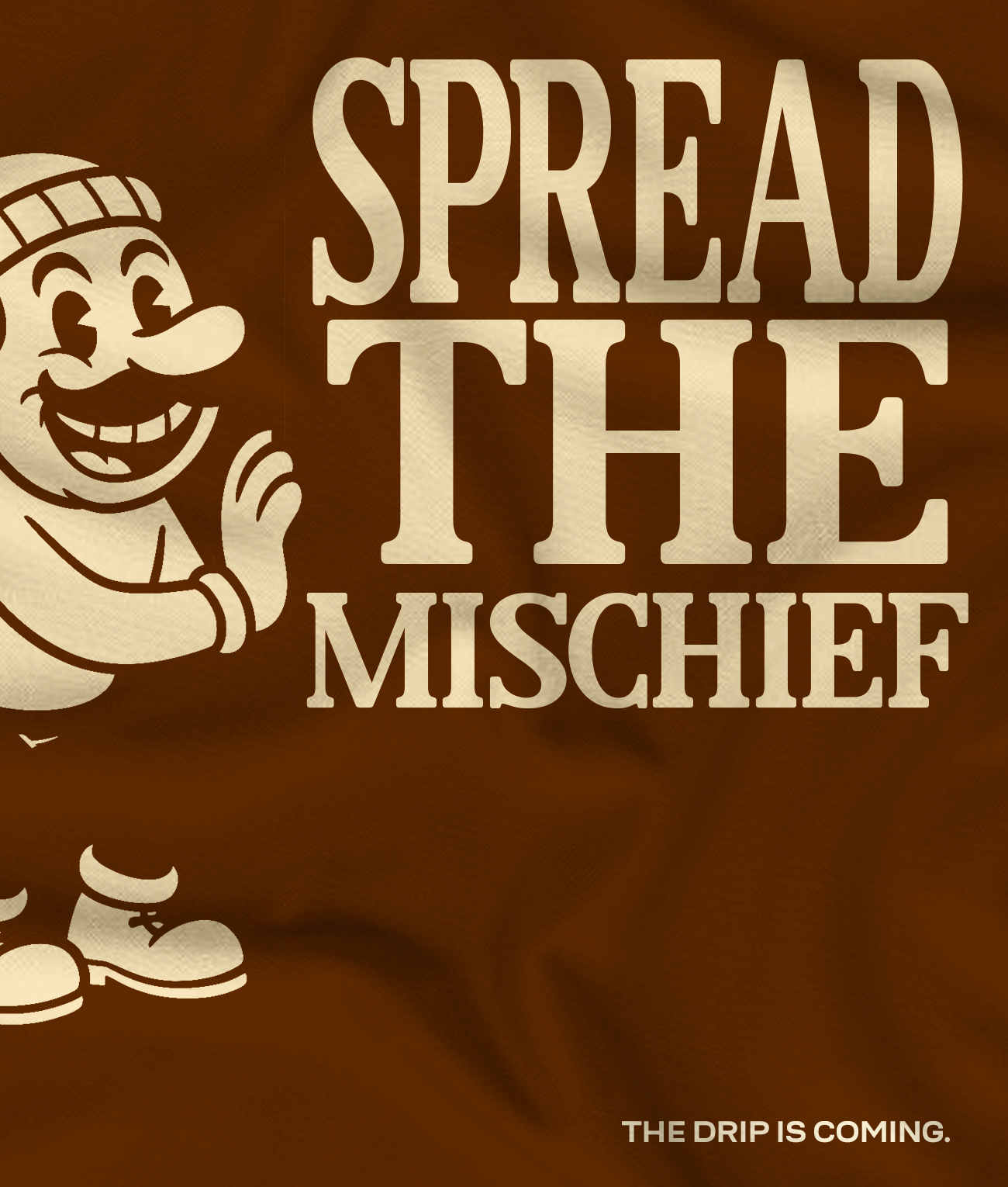
The wall graphics push the campaign voice further with bold lines like “Waffles Beware” and “Spread the Mischief.” Each design keeps the same warm colors, retro mascot, and syrup-inspired tone.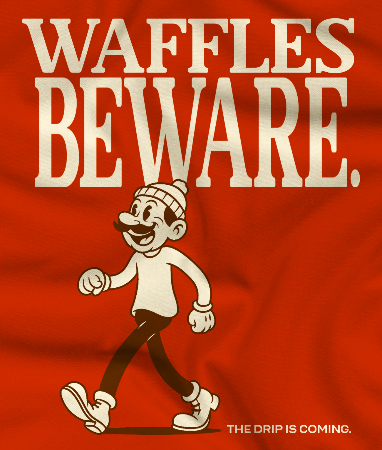
Next - 008 / Projects
Illustrated Book Covers→Available to work